BAFTA - Events booking
This project has been assigned the following categories: Brand & design,
-
Accessibility improvements
-
Improved the UX and UI
-
Designed for desktop and mobile devices
Client overview
The British Academy of Film and Television Arts (BAFTA) is a world-leading independent arts charity that celebrates the very best in film, games and television. BAFTA is a returning client of Scaramanga, and they approached us with the task of improving the usability and user interface (UI) of their jury voting app.
Project overview
Although BAFTA is renowned for its award ceremony, the organisation does so much more. One area of activity they have high demand for is booking one of the many live events and screenings they programme all year round for their global audience.
After the original booking system was released, the BAFTA Media team acknowledged that the user experience could be vastly improved so the ask Scaramanga for assistance.
We designed and delivered a comprehensive set of annotated visuals that the BAFTA Media used when integration the design into their system.
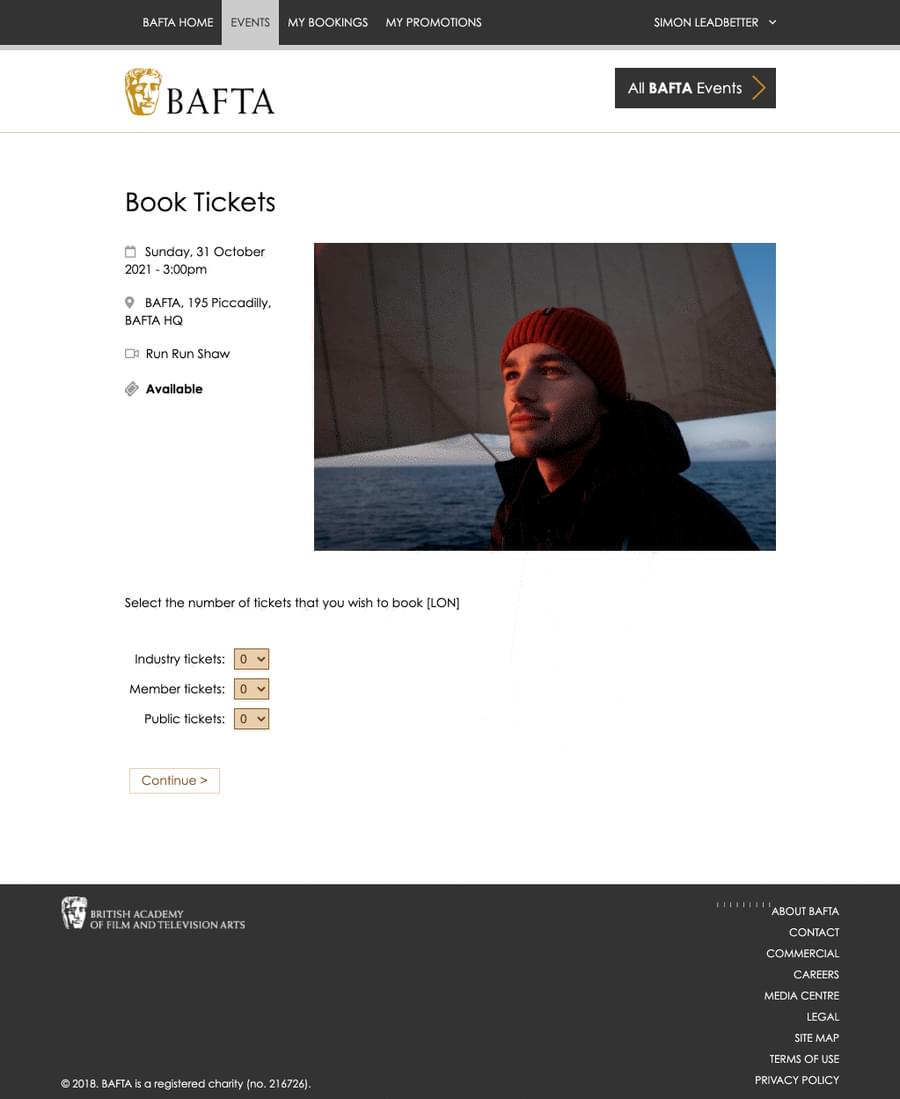
BAFTA Events before
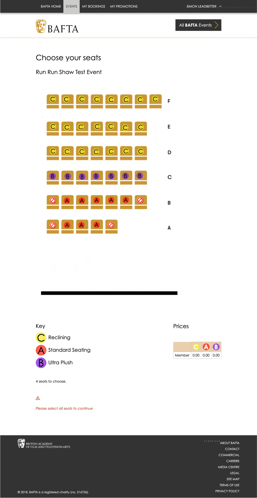
To provide some context to the changes we made it is worth taking a moment to see how things were before our involvement. The UI components on the event details were recessive and the complex labelling on the seat selection page made it very difficult to navigate.
Our goal was to vastly improve the overall User Experience (UX), but, importantly, we wanted improve the experience for all users ‚ including those with a disability.
Identifying the pain points
We walked through the booking process multiple times, assessing the experience through the lens of different users (using the personas we created). This revealed the various pain points a user were likely to encounter. However, we did not only review BAFTA’s events booking system. We extended our review to other popular booking systems and this revealed a common accessibility issue: an over reliance on colour.
For us, this was something we did not want to ignore.
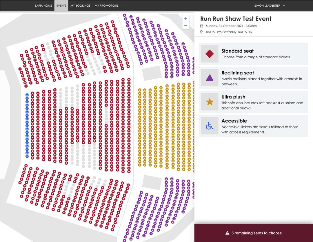
To aid identification of the different seat types, we devised a key that was presented to the user high-up in the visual hierarchy. However, the important feature of our key was to use shapes in addition to colour to identify the seating type.
The key had to work on both complex and simple seating plans, so it was important that the structural shape of a circle was maintained so it could be easily placed on different seating plans.
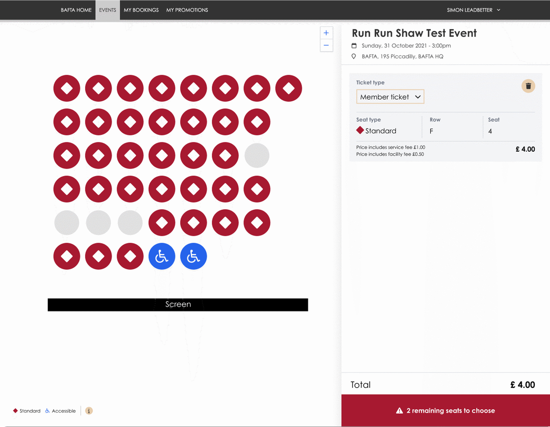
The side-by-side split window allows the user to interact with the seating plan (panning, zooming in-and-out) without loosing focus of the key contextual information displayed in the right-hand pane.
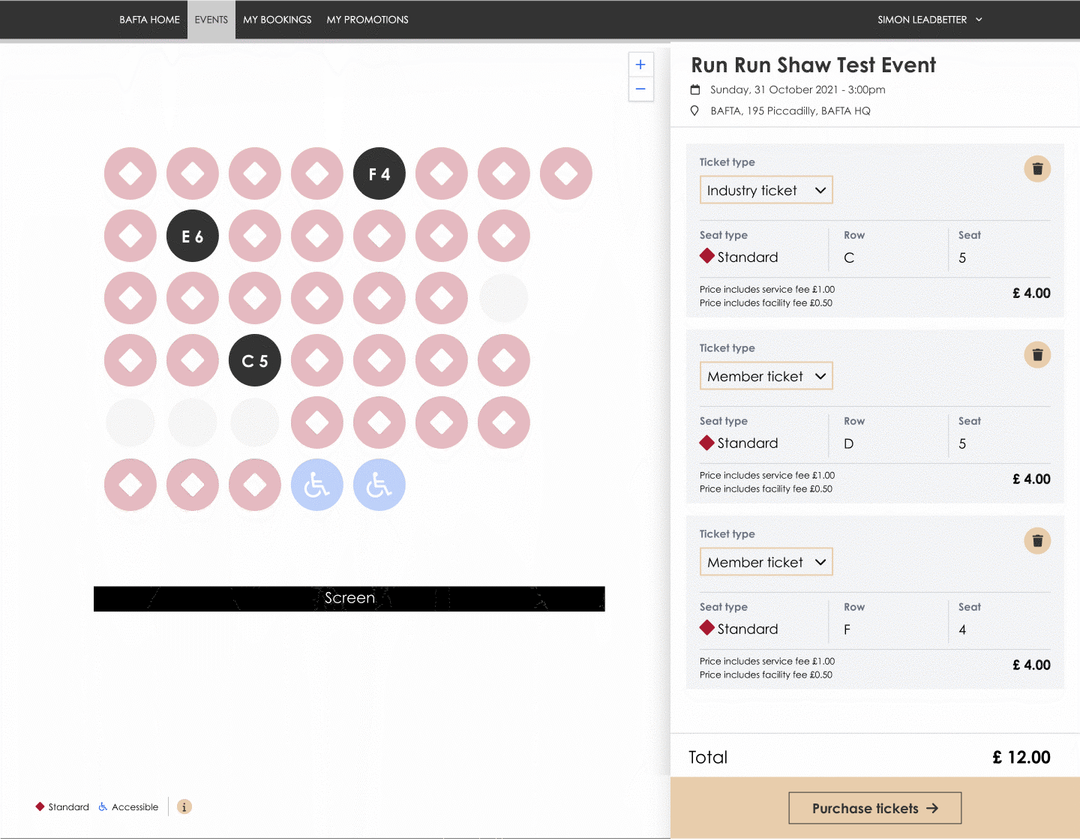
As the following image demonstrates, the user can easily correlate their seat selection to the tickets and easily adjust the ticket type all on the same page.
Mobile support
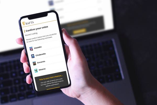
And, yes, we made sure the design worked equally as well on mobile devices…
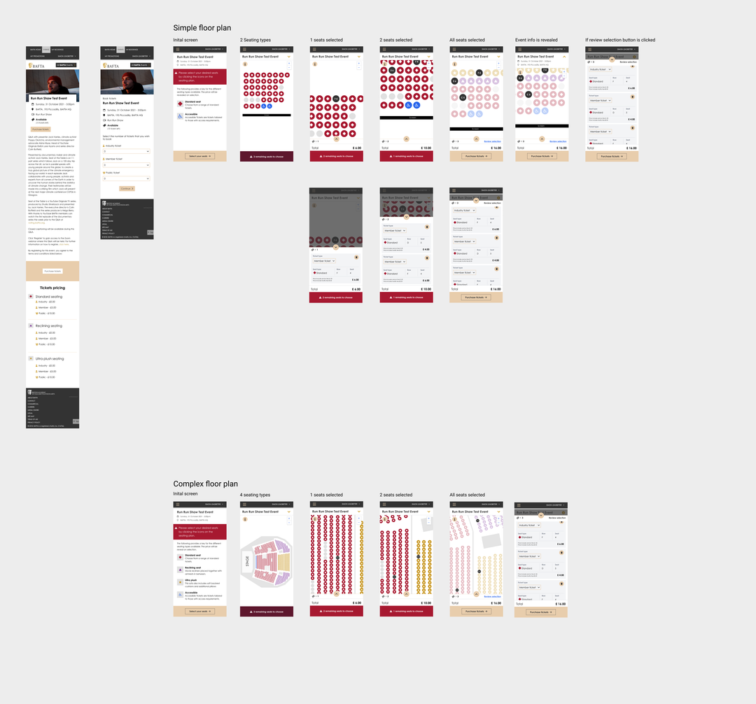
Booking is only available for BAFTA members, so we are unable to share a link to the final product
BAFTA upgrades jury voting service with Scaramanga
Like what you see?
Book a meeting with our experts and let’s find out how we can help you.
