Building Bremont’s online product configurator
Written by Claire Scaramanga
We have been working with Bremont Watch Company since 2013 and our collaboration has seen us work on numerous digital projects over the years. However, when we started talking about building an online product configurator, we soon realised that this project was going to be something special.
This article has been assigned the following categories: News,

The brief from Bremont
The luxury watch market is a highly competitive sector and, as with any competitive marketplace, innovation is a key ingredient for success. Enabling customers to create their own luxury watch offers the ultimate in personalisation and increases the joy of ownership.
Collectors, first-time owners and gift buyers will all find it immensely appealing to own something so unique and, from Bremont’s perspective, it is hoped that this appeal converts into increased online sales.
The technical challenges
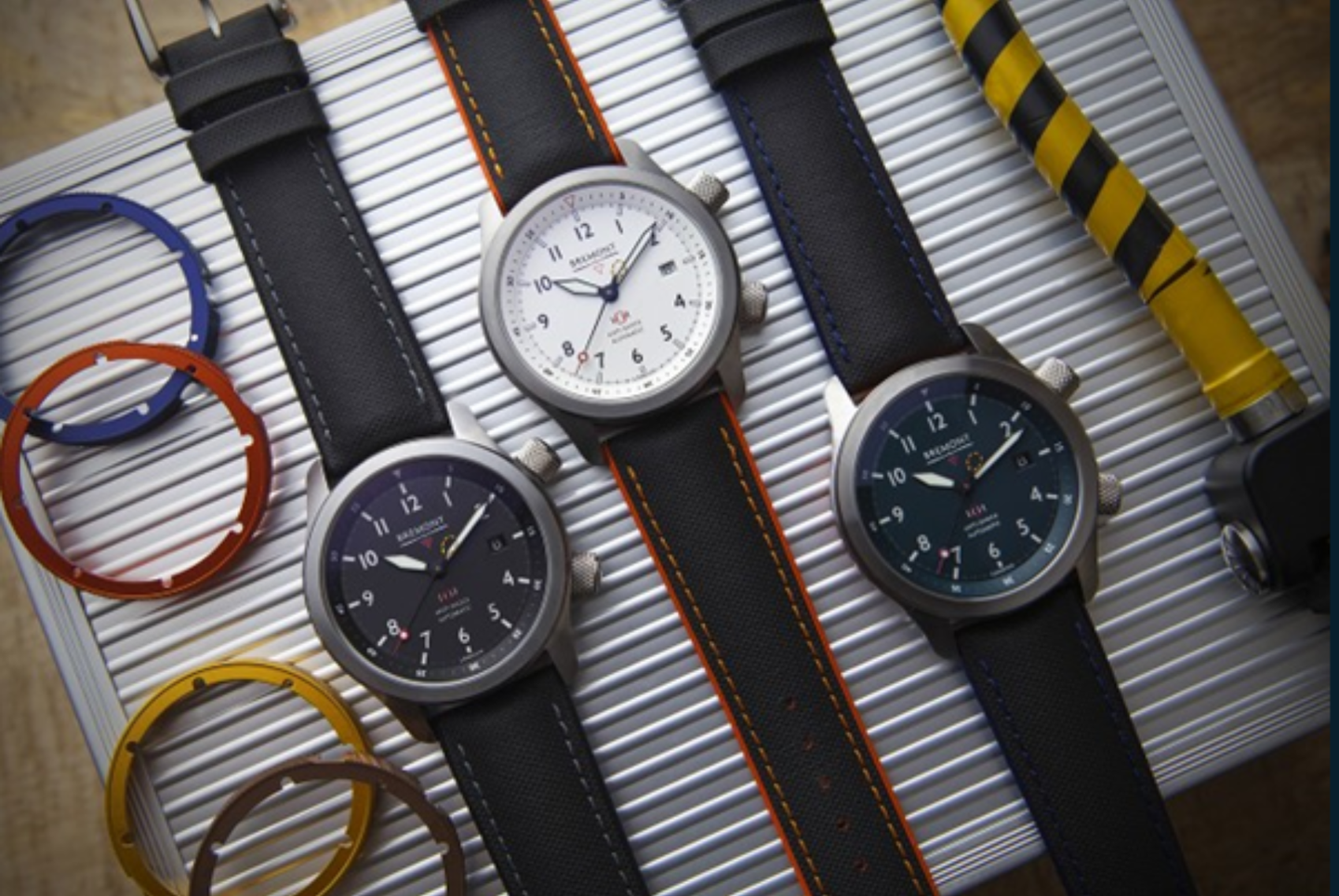
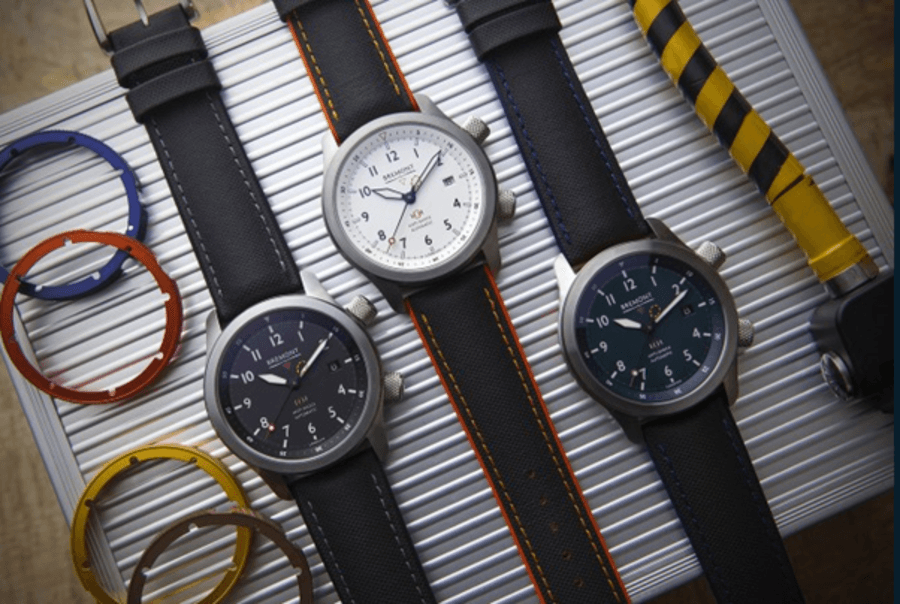
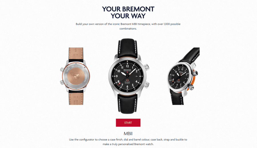
The configurator has been developed solely for Bremont’s successful Martin Baker II model, as it is best suited to provide genuine options for the user to select between. Everything from the case material, dial colour, barrel colour, case back, strap and buckle can be changed.
Great for the user, however, from a technical perspective that equates to 1,000 different product configurations. That is a lot of data to manage.
As with anything on the web, the configurator had to be intuitive to use, fast loading and be highly responsive. At no stage could we risk the configurator becoming unresponsive as the user progressed through the configurator, because they would simply abandon their journey.
Ironically, we could not build the configurator to only have a couple of steps, otherwise the user may feel cheated if the configurator did not offer enough options.
The prospect of dynamically loading over 1,000 different configurations was daunting, so we needed to find a solution to simplify the whole process.
We were also keen to avoid cutting out thousands of watch images!
The Scaramanga solution
Making calls to the database is technically expensive. It places strain on the server and can create bottlenecks – especially if multiple users are making requests at the same time.
Clearly, we could not limit the number of people using the configurator, so we excluded the idea of dynamically loading the data at the point of request.
Our solution was to create a decision tree, where all possible pathways are rendered to a single file. Once this file has been generated, it is cached so the user does not have to wait for it to be regenerated.
Once downloaded, this single file allows the user to explore any combination without having to make a single database call. This makes the entire user experience extremely fast.
The only thing the user’s device has to load are the optimised images. Even these are intelligently preloaded based on the user’s current selection.
In fact, due to the smart way we designed the configurator it allows for the reuse of the same image fragments. Each component of the watch (i.e. dial, barrel, strap etc.) has been carefully cut-out so they can be reused based on the current selection.
This means that, at each stage, the displayed watch is compiled from a number of different image fragments – dramatically reducing the number of images.
How we delivered
Our first task was to identify all the technical challenges. We then discussed the best solutions and created a project plan, which included: a shot guide for the photography, user journeys, site plan, technical specification, etc.
The Scaramanga developers then worked on a proof-of-concept, whilst the design team got to work on the visuals.
The actual configurator is built to be a standalone entity, using Craft CMS to manage the data. It is then embedded on a template within Shopify.
We worked with The Armoury, who managed uploading the products in Shopify, whilst we concentrated on the configurator design and build.
We also liaised with the excellent photographer, Robert Smith Photography, who built special rigs in order to get the different angled shots and precision we needed.
Bremont MBII Product Configurator mini demo video
What makes this project special
This project used many of Scaramanga’s skills and services. Everything from idea generation, design, technical development, Photoshop work, project management to collaborative working.
Importantly, we met every deadline and delivered the project on time which, for a project as technical as this, is no small feat.
We built the configurator to be extendible. Therefore, if there is ever a need to expand the number of models then it would be possible.
Bremont is also benefiting from our decision to build the configurator as a standalone entity, We have created an embeddable option, so Bremont can share it with their partners who can embed it on their website – increasing the customer touch points.
To further enhance the user’s personalisation options, we also updated the product page (on Shopify) to include the ability to add engraving and benefit from 0% interest financing options – providing no excuse for the user not to buy their fabulous creation.
And for those who are really keen on their MBII watch, they can share it on social media channels directly from the product page.
Initial results
The Bremont MBII Configurator was launched on Friday 24th April 2020 and has already made several sales. It’s early days, but it looks like it will exceed everyone’s expectations.


