The case for using an accessible typeface
Written by Peter Burgess
For someone with poor vision, learning disabilities, aphasia, or dyslexia, the readability of text or a document is not only due to the colour combination. It also greatly depends upon the font or typeface used.
This article has been assigned the following categories: Accessibility,
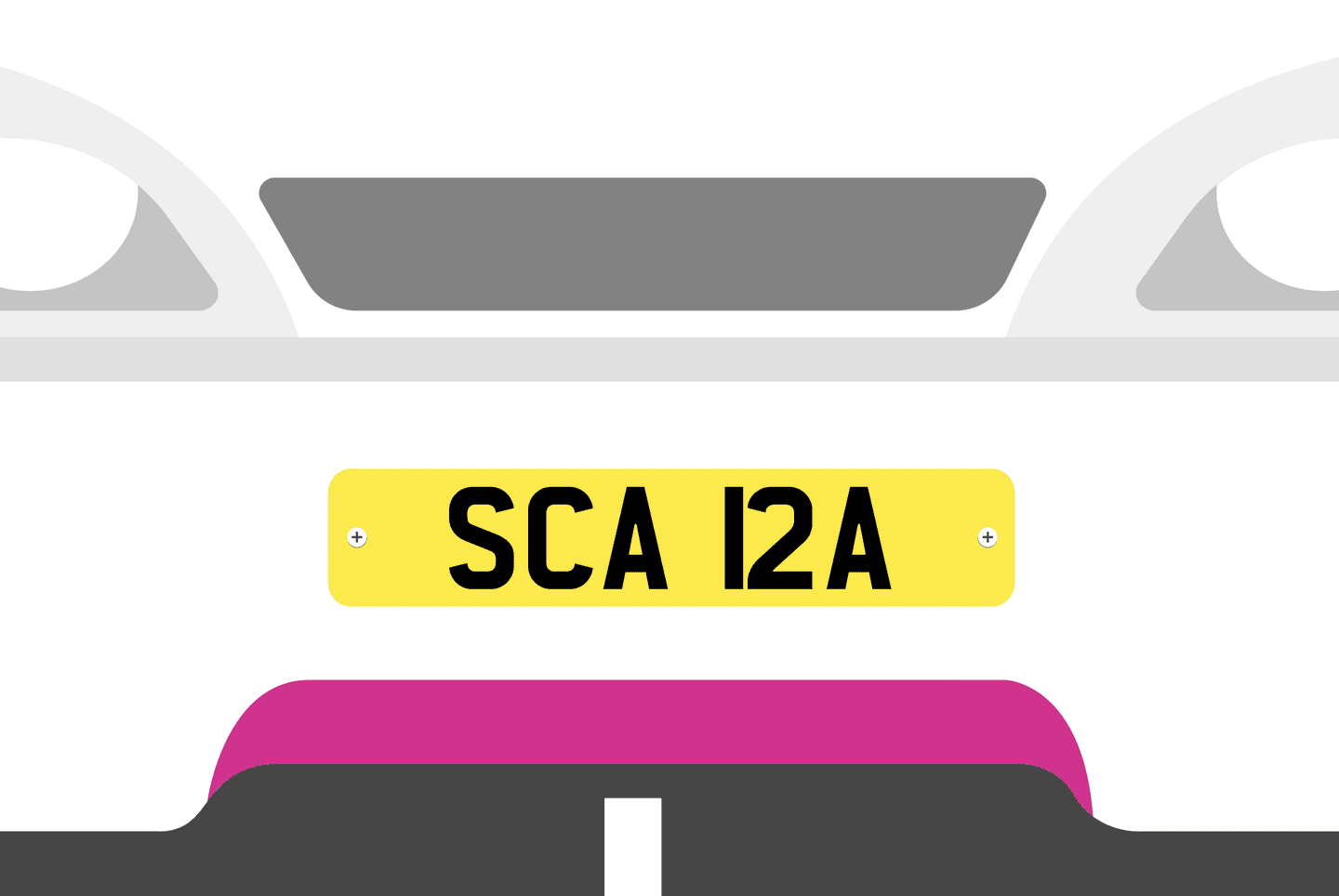
N1 NJA, J5NNY, BE61 NER or SCA 12A.
Chances are, you have seen personalised number plates like these out and about. Whether you love them or hate them, personalised number plates are prime examples of how people deliberately play with the structure of the typeface to create a word. The font used on vehicle registration plates is generally designed to adhere to very specific guidelines to make it as legible as possible. A personalised number plate actually does the opposite of what the typeface is intended to do.
Number plates are just a small real-life example of how, despite choosing the right colour combination and performant typefaces, the application of such can still have a massive impact on accessibility.
For someone with poor vision, learning disabilities, aphasia (language or speech difficulties caused by damage to the left side of the brain) or dyslexia, the readability of text or a document is not only due to the colour combination. It also greatly depends upon the font or typeface that is used. It is why, selecting typefaces that enhance legibility and readability is a core foundation of accessible visual reading experiences. Sadly though, there seems to be a lack of guidance on how to do so.
Typeface design
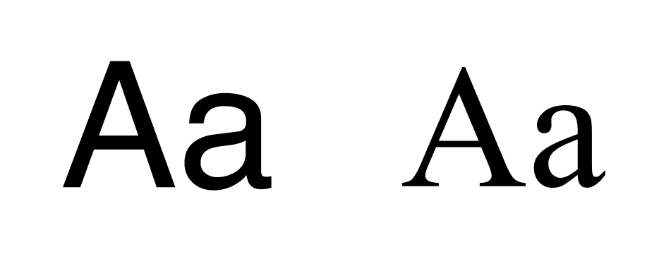
Sans-serif vs serif
Generally speaking, people with poor vision and dyslexia prefer a sans-serif font compared to a serif [1].
Serif fonts, with their decorative stroke, tend to obscure the shapes of the letters, whereas the simplicity and the disambiguated letter shaping of sans-serif can aid individual character recognition and help enable fluid readability.
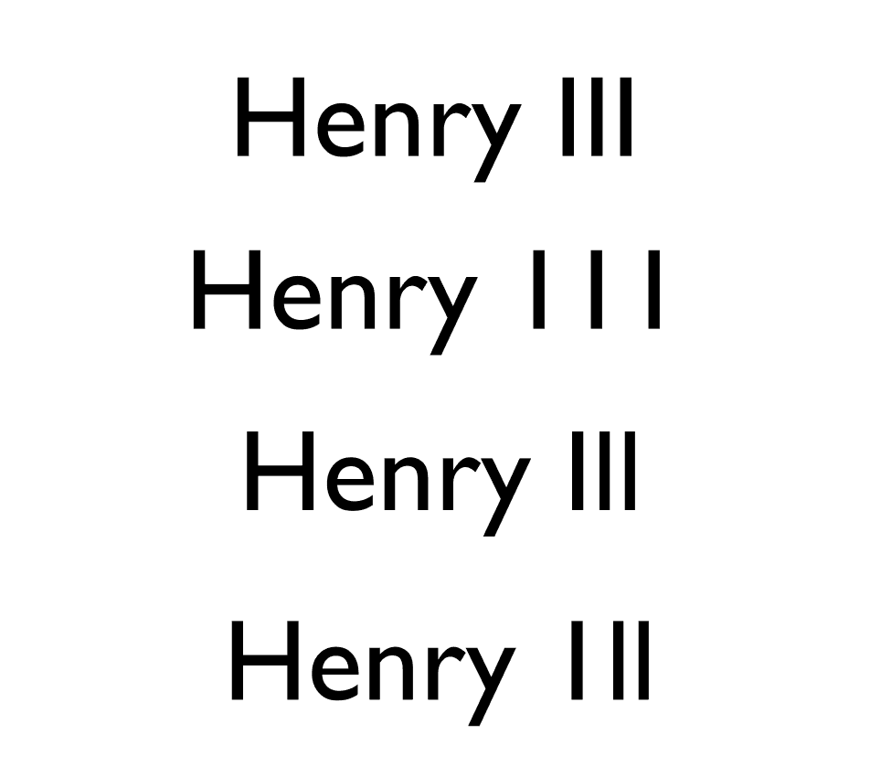
However, sans-serif can sometimes lead to confusion with similar letter combinations (i.e “rn” and “m”) or if there is not enough difference between characters (i.e Il1 (uppercase i, lowercase L, and number 1).
With that in mind, we have created a short guide to select the most legible and accessible typefaces.
General rules
1. Try to avoid typefaces with imposter letter shapes.
It is important for letter shapes to be unique. Similar letter shapes
or combinations can be confusing for people with visual impairments or
dyslexia.
Uppercase I (i), lowercase l (L), and 1 must all have different characteristics from one another.

2. Try to avoid typefaces with mirroring letters
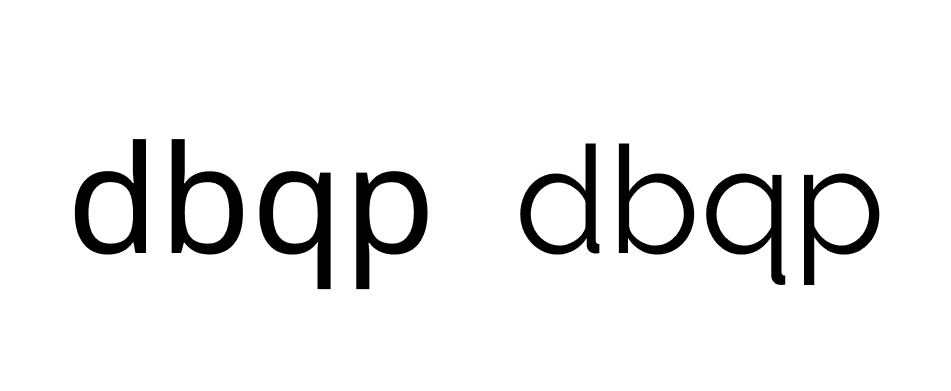
As part of early neurological development, almost all children flip letters horizontally and this can continue into adulthood [2]. Ensure that your typeface has unique shapes individually.
3. The character should be unique and easily distinguishable
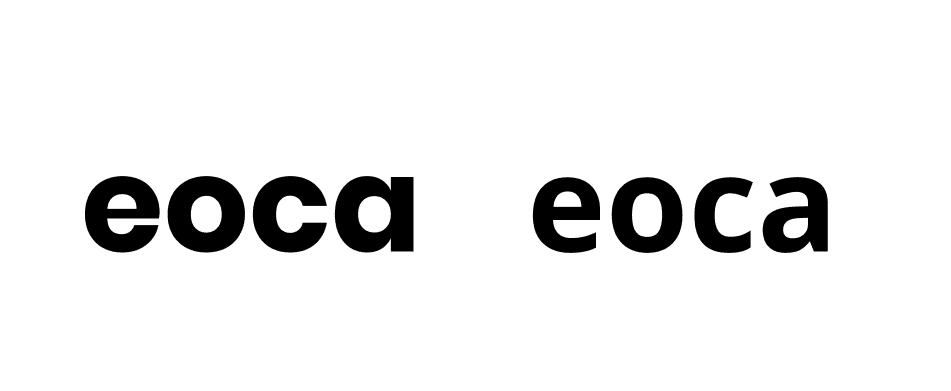
Generally speaking, characters e, o, c, or a can be incorrectly recognised by those with moderate to severe vision impairment.
Select a typeface with a more open counter to increase legibility and readability.
4. Ensure adequate spacing between letters
Tight letter spacing (kerning) can reduce readability for the visually impaired, especially if displayed in a small size. Character combinations such as “rn” can be easily mistaken as “m”, or “lo” as “b”, or “vv” as “w”.
Otherwise, words like “clear” could be read as “dear”, or "burn" could change to "bum"!

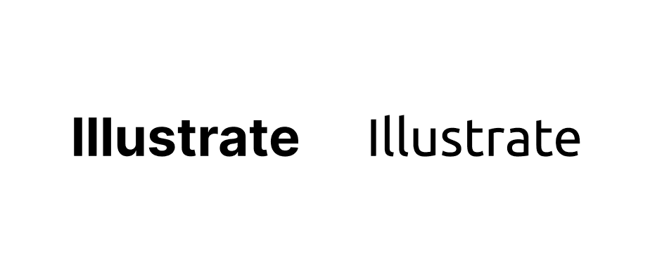
5. Ensure there is a difference between capital height and ascenders
Prominent ascenders (such as the vertical line in L or d) can greatly aid legibility.
6. Avoid display fonts
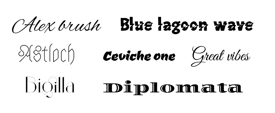
While in some cases, display fonts are visually appealing, they are quite hard to read. It is highly recommended to avoid display font and choose a more commonly used font family instead.
Why I wrote this article
Although more research is necessary, from the available literature found online, it is possible to form a set of preliminary guidelines for selecting a performant and accessible typeface.
In an effort to become more inclusive and accessible, we took the time to reflect upon our own brand and found that our colour combinations and typefaces are not 100% accessible.
After countless hours, sleepless nights and heated discussions, we decided to "rebrand" ourselves. We used the guidelines above to help choose our soon to be revealed typeface.
As a company, we believe that accessibility and inclusivity should be a golden thread that runs through everything we do.
We hope that this article will spark a discussion in your business on how to effectively choose a typeface that improves readability and accessibility.


