Helping BAFTA achieve better user experiences
For most people, it is a surprise to discover BAFTA do more than an awards ceremony. They are actually an arts charity with many different strands of activity.
Working with the BAFTA Media team, we have helped shape a number of the products with our design, UX and accessibility experience.
- 12 min read

Virtual Piccadilly
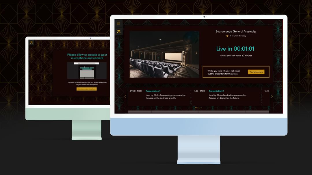
Scaramanga began working for BAFTA in 2021, initially helping them develop an improved user experience (UX) and user interface (UI) for their Virtual Piccadilly app — an online/hybrid networking and events product.
After an initial period of research and discussion, we developed our design ideas as wireframes and presented them to the BAFTA Media team.
Once the wireframes had been approved we developed a comprehensive set of high-fidelity visuals in Figma. Using Figma allowed the in-house development team to use it as a reference when developing the app.
The entire process went like clockwork and the client was extremely please with the result.
Testimonials
Thanks this is great and thanks for delivering this all so quickly. It's been great to work with you on this project and everyone is really happy with the designs.
David Lortal Consultant Product Manager, BAFTA
Jury voting system
The original jury voting process involved gathering the jury in a room, with a single tablet that would be passed around so individuals could cast their vote. This process would be repeated until all votes were cast and voting was complete. However, COVID put a stop to these type of in-person meetings, so an alternative online voting system was quickly created to ensure continuity of the BAFTA awards.
As the online voting system was created in haste it lacked the finesse the BAFTA Media wanted to deliver.
There were a number of pain points we wanted to resolve with our new design which also had to accommodate various technical considerations. However, once again, we delivered a suite of in-depth visuals that the BAFTA Media team used when implementing it into the existing voting system.
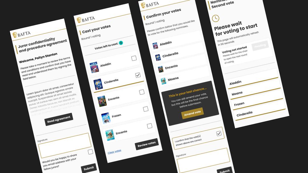
Our attention to detail and above-and-beyond approach to accessibility is highly valued by BAFTA
Event booking system
BAFTA clearly enjoy testing our UX, UI, accessibility credentials with another project requiring all three disciplines.
As with all the other projects, we went through the usual stages of research, wireframes, ideation, internal review and presentation. However, we are particularly pleased with the innovative solution we conceived when considering the needs of everyone.
Relying on colour alone is a big accessibility no no. With this in mind we knew the industry standard approach of displaying seats with a colour key was not going to work.
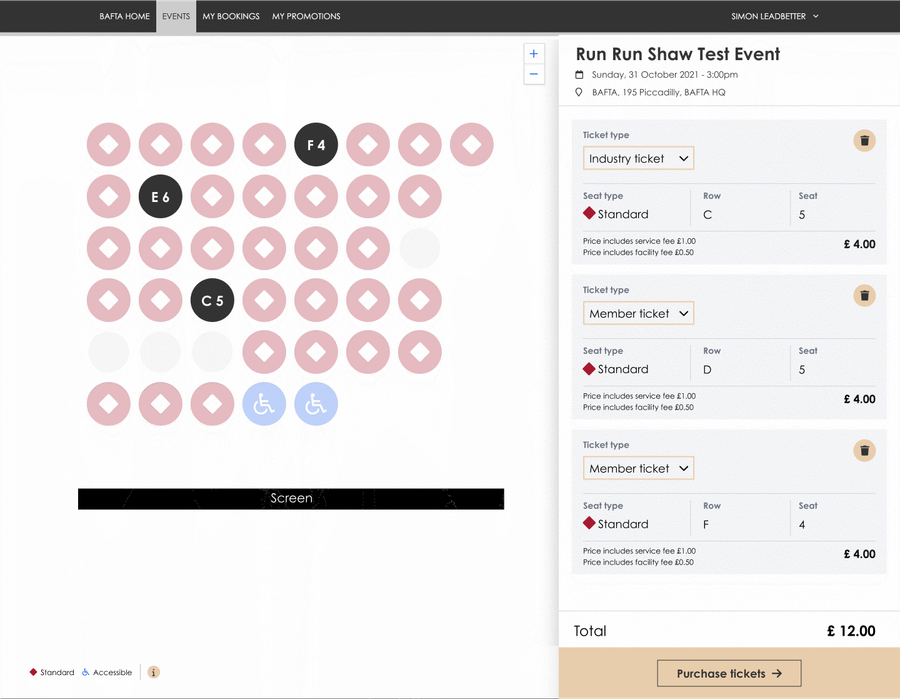
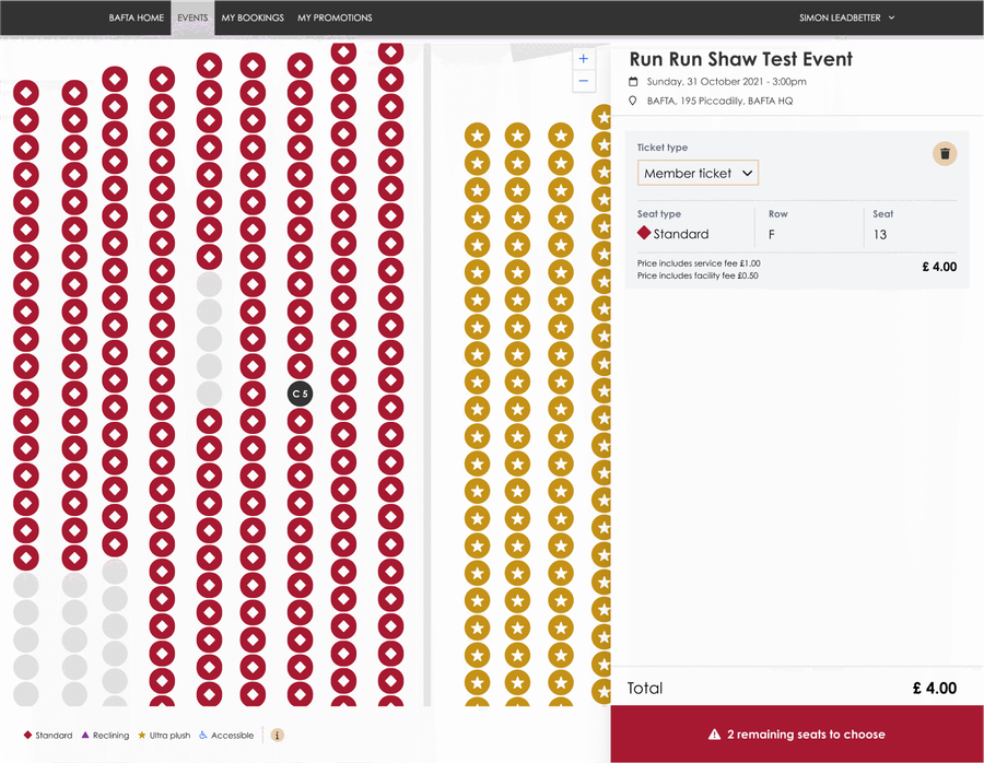
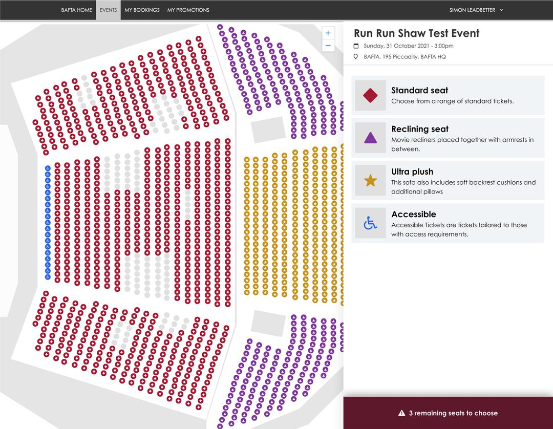
A simple, yet highly effective improvement we recommended was the addition of shapes to identify the seat/ticket type alongside the colour variations.
This single change should help the 1 in 12 men and 1 in 200 women with some form of colour blindness.
What’s next?
Our commitment to accessibility, ensuring we consider the needs of everyone, has struck a cord with BAFTA. We are currently providing accessibility consultancy services in a series of workshops — created to enlighten and inform their technical and non-technical teams.
Like what you see?
Book a meeting with our experts and let’s find out how we can help you.