Installation and Refurbishment Solutions brand refresh
This project has been assigned the following categories: Marketing campaigns,
-
Brand identity
-
Brand guidelines
-
Brand awareness
Client overview
IRS is a specialist office interiors and relocation company who provide individual solutions for office moves or refurbishment.
Project overview
IRS are experts in designing beautiful office interiors, but they had lost focus and visibility. They came to Scaramanga to develop a marketing strategy to put them back in the spotlight to acquire new clients and gain prominence in Croydon, which is experiencing massive construction and growth.
A key component of the marketing strategy was to a review of the existing identity, which had got a little shabby. Rather than reinvent the wheel we tightened up the design of logo and established rules about colour, typography, use of imagery etc. This was then followed through in the design of the new website, launched spring 2021.
The results have been great, generating significant high value business for IRS, putting them right back on the map.
Animated IRS logo
We helped IRS with a full range of marketing services including:
- Content marketing, digital, email, social media and SEO
- Brand refresh, including logo
- Brand guidelines
- Brochure design
- Website design, build and maintenance
Our first task was to review the existing identity which, as the client’s admission, was a little rough around the edges. We identified problems with the logo (it looked like it was falling off the underline); typographic inconsistency with a mixture of colours and typeface; and problems with messaging. They were colloquially known as IRS, but there is another much bigger organisation that comes to mind when first see the IRS initialism.
The tagline
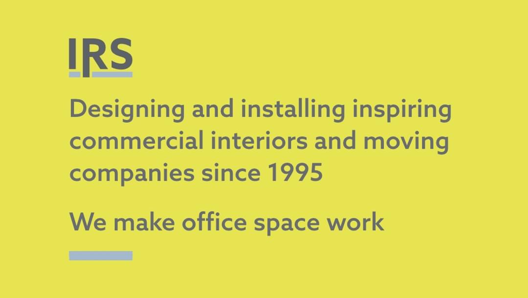
To allow the client to continue using IRS as their main logo, we made a feature of their tagline as it explicitly explains their offer…
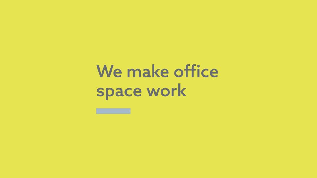
We created the tagline in both the short form (above) and a longer form version (below) which is used on the brochure cover, exhibition roller banners and other marketing material.
The addition of the blue underline, taken from the logo, enhances the brand recognition and allows the tagline to exist as a standalone component.
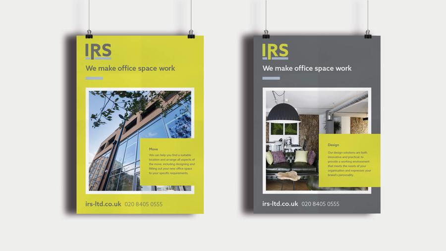
The following images show how strong the combination of logo, tagline and restricted colour palette of yellow, grey, white and splashes of blue.
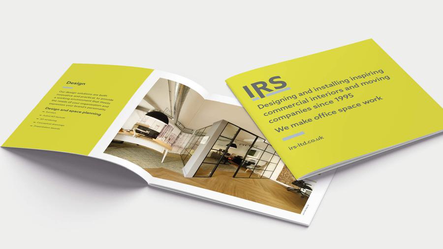
Image treatment
Thankfully, the commissioned photographs provided by IRS are as good as their work so it is very easy to use these images untreated. However, we did provide a simple duotone image treatment to add an extra dimensions to the visual identity. Used with restraint it can add a little texture to an otherwise flat (i.e. solid colours) design concept.


Comprehensive brand guidelines
As you would expect, the IRS brand guidelines are full of instruction and advice. The client who, as a designer, appreciated the exacting level of detail we went into and genuinely used them to ensure the ongoing integrity of their brand.
IRS brand guidelines animated
Related project
Like what you see?
Book a meeting with our experts and let’s find out how we can help you.


