ORCA
This project has been assigned the following categories: Websites, UX/UI,
-
UX & UI
-
Iconography
-
Streamlining content
Client overview
With nearly 30 years of marine conversation expertise, ORCA is a UK-based whale and dolphin protection organisation that contributes to several high-level global conservation initiatives.
There are over 25 different species of whales, dolphins and porpoises that have been recorded in UK waters — which we now know are collectively called Cetaceans. OCRA collects data on these Cetacea, giving them the ability to make insightful arguments that have led to better protection of whales, dolphins and porpoises in ocean hotspots.
ORCA offers a range of opportunities for the public to contribute to protecting the species and raises awareness about their critical habitats. These include becoming a “citizen scientist” and studying the species, becoming an OceanWatcher to collect data, making donations to support the cause and experiencing sea safaris to see the species first-hand.
Project overview
Before the web agency Thoughtful merged with Scaramanga in 2019, they pitched for the original build of Orca’s website. Although they didn’t win it at the time, Orca remembered Thoughtful’s affinity to their values and later reached out to Scaramanga for the website redesign commission.
Orca’s main aim of the website redesign was to increase traffic to the Donations page (and in turn, increase donations).
They also wanted to make the imagery more prominent. Their previous site was text-heavy, so we broke up the text with imagery (including parallax images and galleries), shorter paragraphs of text and CTA’s.
Orca wanted to add a human touch and inclusive element to the website to emphasise that anyone can become a “citizen scientist” and volunteer with Orca. They also wanted to use less technical jargon so that a wider audience could understand it.
Testimonials
Thank you also for all your hard work with the website, we are so pleased with how it has turned out and have had some really lovely comments from our supporters and volunteers.
Emily Condley Supporter Development Officer, ORCA
Our approach
We chose Craft as the CMS to build this website because it allows for bespoke and accessible elements (such as typeface, font size and images) and is more intuitive than other CMSs. It allows for a live preview and is constantly being updated and improved. It’s also less likely to be hacked compared to other CMSs.
We started with the sitemaps and then audience personas to understand the different types of people who would be using the site. We then created the wireframes to ensure the layout was correct and that all the content was on the page before launching into the design.
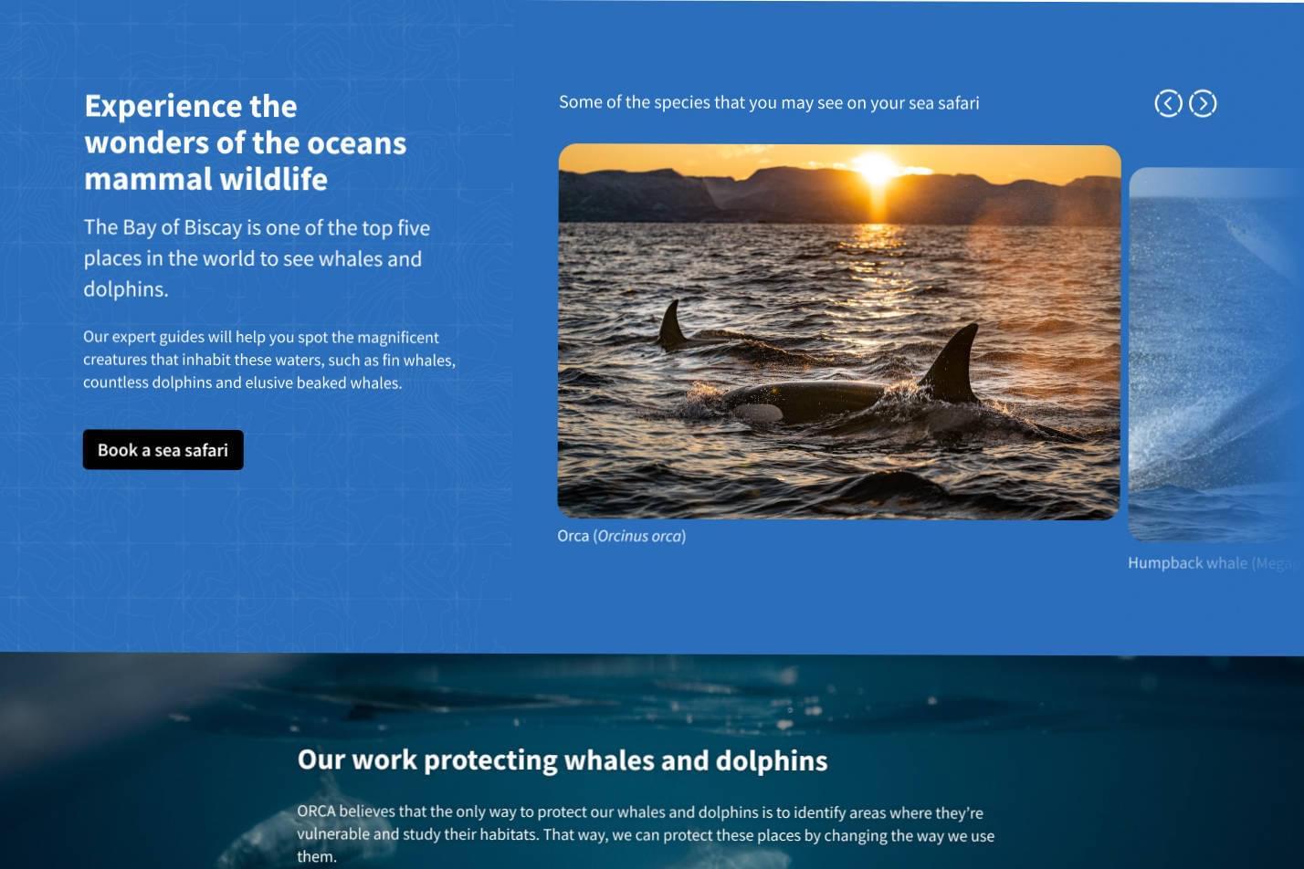
The previous site used a lot of white and orange. In the new site, we wanted to bring in natural colours of the sea - blues, blacks and greens. We also rounded the corners of the imagery to reflect the curved, smooth bodies and fins of dolphins and the curves of waves. The silhouettes of the people standing on a boat, looking out and spotting whales, add a human element to the website’s footer.
Throughout the website, many intricate details and allusions tie back to what Orca does. Some of the content blocks’ backgrounds have a contour grid map texture on a blue background, representing Orca’s ocean whale and dolphin spotting. The arrow icons have circular frames with lines cutting through them to represent looking through a boat’s porthole - a metaphorical window to the next opportunity lying ahead.
The old website had a lot of dead-end pages. We therefore ensured that each of the website’s new pages directed users to other pages within the site, keeping users on the site longer.
The overall result of this project is a bespoke website that is grown up but approachable and an effective mechanism to convey research.
Homepage
On the home page’s Call To Actions (CTAs) (‘Whale & Dolphin Sightings’ and ‘Make Donations’), we used striking imagery. On the ‘Make a Donation’ CTA, we used a looping video of Cetacea to draw the user’s eye to it and push people to the donations page.
The photo gallery has the images positioned vertically up and down to signify the rise and fall of ocean waves.
In the ‘The State of Cetaceans’ section, we turned some of Orca’s statistics into modern infographics to allow the users to understand these numbers visually. Originally, these statistics were on an internal page of the site, but we moved them to the home page to draw more attention to them. A benefit of using Craft for this is that it allows the statistics to update by the client.
A video showcasing elements of the site
The photo gallery has the images positioned vertically up and down to signify the rise and fall of ocean waves
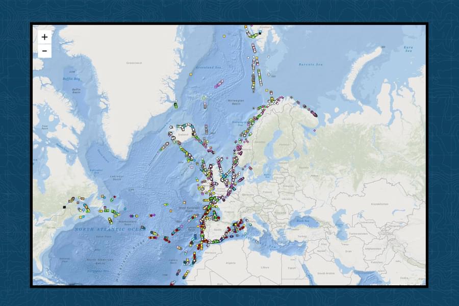
Whale & Dolphin Sightings page
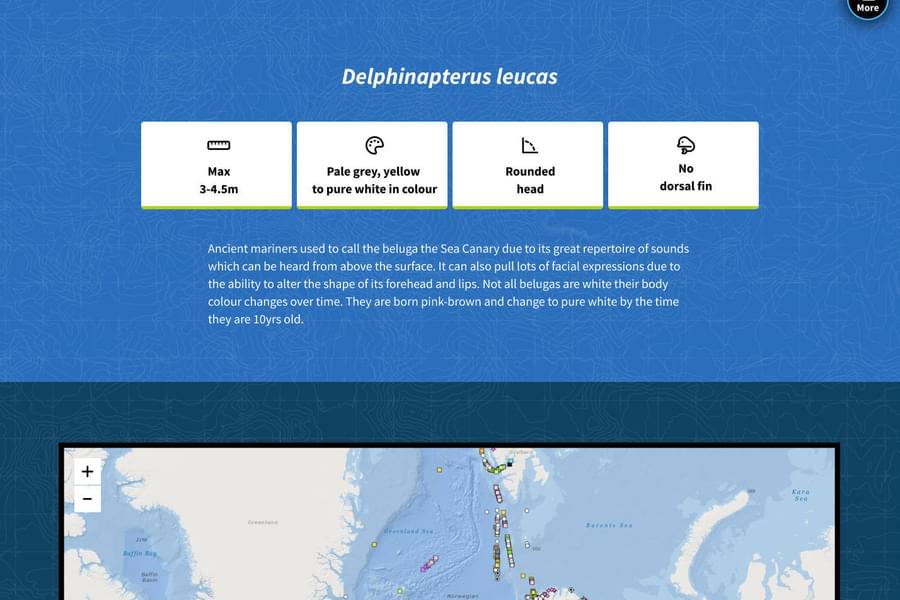
On the Whale & Dolphin Sightings page, under the Species and Sightings section, we created three different informative sections on Whales, Dolphins and Porpoises. We used iconography on these pages to visually convey key pieces of information quickly and easily.
Using the Antarctic minke whale page as an example shows how we created four icons to represent the size, colour, baleen (the filter-feeding system inside the mouths of whales) and whether the species has a dorsal fin (fin at the back of the whale) or not.
Join ORCA
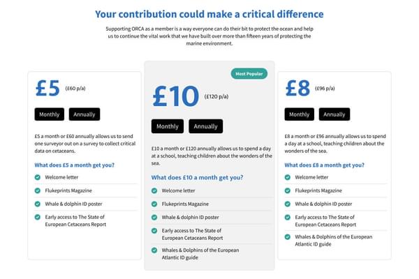
Orca wanted to promote the Join page to encourage more donations. On the old site, it wasn’t as prominent and now we’ve made it a feature on the home page. On this page, you can see the different price plans. We gave the £10/’Most Popular’ price plan more prominence by using a subtle grey box behind it and a text box saying ‘Most Popular’ to direct people there.
Outcome
Orca can now maintain, update and enter content into the website themselves as we set up content templates for them to do so.
Like what you see?
Book a meeting with our experts and let’s find out how we can help you.
