Creating accessible content
Written by Claire Scaramanga
Many of the recommendations in this article will also support your SEO performance – a true win-win!
This article has been assigned the following categories: Accessibility, Inclusivity and diversity, Tips,

After you have made your website accessible, the next step is ensuring that your content is also accessible, so that your site continues to comply with the WCAG accessibility guidelines.
This means working with your content creators and publishers to understand what makes content accessible, including how it is added to the website.
Plain English
The Plain English Campaign has been around since 1979, championing the need for clear, easily understood and jargon-free writing.
Their advice is an excellent starting point for writing great accessible content to benefit every single visitor to your website (as well as any other offline content that you create).
Here are their key recommendations:
- Short sentences
- Active verbs
- I and we (first person), not they (third person)
- Avoid jargon
- Avoid nominalisation
Sentence length
The Plain English Campaign recommends writing sentences that are no longer than 15 to 20 words and use bullet points to provide summary information.
I would recommend minimising the use of subordinate clauses. If there is extra information, see if you can make it a separate sentence.
When you are writing web copy, I would also recommend that you keep your paragraphs short. We tend to skim read more on a screen, and long blocks of text make your brain hurt. Your reader is likely to get lost in the middle - if they even ever got that far!
Active verbs
Active verbs are more lively and engaging. Sentences are usually more concise. The Plain English Campaign recommends making 80 to 90% of your verbs active. An example of this would be to choose the active “I wrote this article” (4 words) instead of the passive “this article was written by me” (6 words).
First person
If you can write in the first person – I and we – it is more personal and more engaging than referring to your business as they, in the third person.
Avoid jargon
If you do have to use industry specific terms, make sure your audience is familiar with it. If they won’t be, but you can’t avoid it, then explain.
I would also add to this avoiding over-complex, long-worded “management speak.” It doesn’t make your content more authoritative – it makes it harder to read and boring!
In a similar vein, if you can choose between an everyday word or a more complex synonym, go for the simpler one.
Avoid nominalisation
You may well be asking what nominalisation is. I did too!
It means taking verbs and making them into nouns. So using “implementation” instead of “implement.” Like passive verbs, it drains the lifeblood out of your copy.
Use sentence case
Please write your headlines in sentence case – only capitalise the first word. Okay, you can capitalise proper nouns as well!
When You Capitalise Every Single Word In Your Header, It Is Much Harder To Read.
It’s English Jim, but not as we know it
A shameless pun from Star Trek - Spock’s favourite comment “it’s life Jim, but not as we know it.” I apologise!
(See what I did there? I explained a reference for anyone who may not have known it).
But being serious, if you are working in other languages, please, please, please use a professional translator and get a native speaker to check it. Don’t use online translation software.
I wrote an article for a client last week that was a commentary on a press release made by a European organisation. The English translation was totally incomprehensible!
Content for users with disabilities
Everything I have written above supports easier access to content for all users, with and without disabilities.
So this next section covers what extra you can do to make your content accessible to users with disabilities:
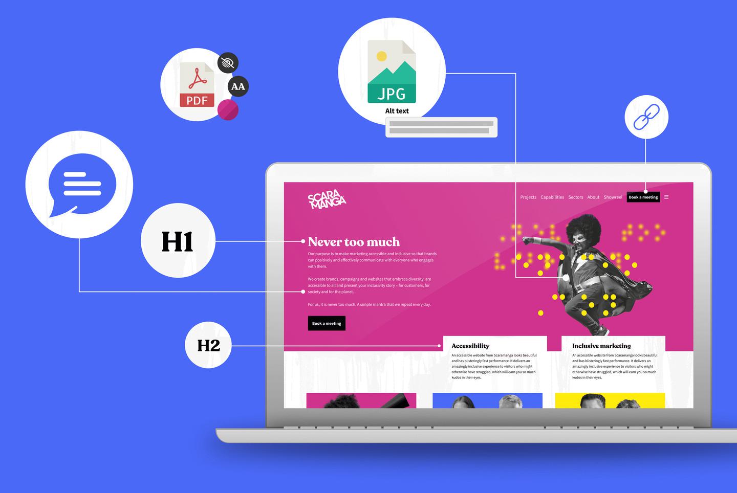
- Structured content that has been added correctly to the page
- Meaningful link text
- Meaningful page titles
- Alternative text for images
- Transcripts and/or captions to video and audio
- Other content, like PDFs
Structure content correctly
This is important for SEO, for making the page look as the designer intended and, importantly, for accessibility.
This means making sure that you add your headers as H2, H3 etc. Don’t just make text bigger and bolder, so it might look like a header to someone who can see the page. For someone using a screen reader, the screen reader will have no idea about the structure or hierarchy of the content and will simply read everything out with no differentiation.
It also means making sure that you add your bullet points correctly. You want your screen reader to say “here is a bullet pointed list; point 1 …” NOT “black dot …”
Meaningful link text
When you are adding a link, make the wording explain what the link is and where it is going. “Visit website” isn’t a great help on a screen reader. Ideally, incorporate the link text into your sentence, for example, “as part of your design process, choose an accessible typeface.”
Avoid using a raw URL – apart from being ugly, a screen reader will read the whole thing out, and they can be very, very long sometimes.
If your link is to a downloadable resource, it helps if you specify the file format and size of the file.
Meaningful page titles
This will help the user understand what the page is about and whether they want to read it. It should also form part of the URL.
Alternative text for images
This is the low-hanging fruit of improving content accessibility. Add a description to all your images, so someone who cannot see them, knows what the image is designed to convey.
If you can see this image, that’s great. If you can’t, what file name/description makes it come alive more for you – “IMG3428964” or “Vivid orange cat’s eyes blazing menacingly out of a black background”?

Add transcripts and/or captions to video and audio
Another piece of low-hanging fruit to support a user who cannot hear the commentary, but wants to engage with your content.
Other content
Don’t forget to make any other content that site users can download accessible as well. This includes setting up and structuring the content correctly, so that a screen reader reads in the intended order and the images all have descriptions.
SEO
Applying all the accessibility recommendations I’ve just covered will also help improve your website’s SEO.


