Writing an accessible social post
Written by Claire Scaramanga
In May 2022, Scaramanga launched our new website and made the brand and site accessible. For me, as our Social Media Manager, this also means making our social media and future posts accessible.
In this article, I will be covering some of the many ways you can make your next post accessible and a few of the tools that will help.
This article has been assigned the following categories: Social media, Accessibility, Inclusivity and diversity, Tips,

Why does making social media accessible matter?
In my previous article on community management, I mentioned that over 3.6 billion people across the world were using social media. Over 1 billion people globally live with some form of disability and this number is increasing.
If you are a business on social media, you are likely trying to achieve high levels of reach, engagement and following. By not considering accessibility, you will reduce the number of users who can even engage with your content.
A few months ago, Claire Scaramanga, our Client Services Director, wrote an article on creating accessible content so do give that a read as well.
Writing an accessible post
Writing with accessibility in mind allows your posts to be successful as they will be clear and understandable, regardless of a person’s disability.
Here are some tips that we use to ensure text remains accessible:
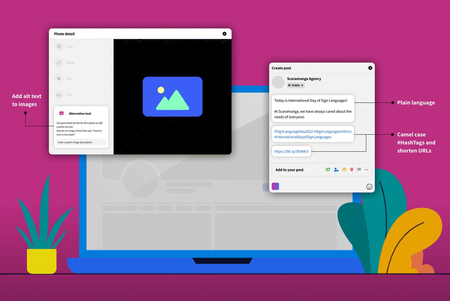
- Avoid jargon: using words by a specific profession or group can be difficult for users outside of that profession or group to understand
- Use short sentences: the Plain English Campaign recommends writing sentences that are no longer than 20 words and use bullet points to provide summary information
- Avoid long paragraphs: when you do need to write a lengthy social post, try to make sure your paragraphs are no more than two or three sentences long. Use line breaks
- Avoid using italicised or capitalisation: all caps and italicised text can be difficult to read and screen readers may struggle to interpret the post
- Avoid using non-standard keyboard characters to replace words: using these can confuse screen readers and reduce legibility
- Use a text reading application: personally, I use Hemingway Editor for advice on how to make my text more accessible. In fact, this entire article has been checked by Hemingway
Using emojis
With over 10 billion emojis sent each day, it’s clear that many love them. But it’s important to understand the accessibility implications when we use emojis.
Are they accessible? No.
When a screen reader reads an emoji, it reads the emoji's Unicode string, a type of alt text. However, the technology for each screen reader can be different, so the result may vary.
Here are some of the best practices to follow regarding emojis:
- Use known emojis that are widely recognised: if you are going to use an emoji, it should at least be one that is widely recognised to prevent confusion and misunderstanding in your post
- Use emojis that translate well among other devices: different devices, platforms and operating systems have different emoji symbols. You can use Unicode’s Emoji List to see what each emoji looks like on what device
- Emojis should go at the end: when a screen reader is used, it will read out the emoji’s Unicode which can be hard to understand if the emoji is included in the middle of a sentence and the Unicode describes the emoji in multiple words
- Emojis vs emoticons: emojis have Unicode, which acts as alt text to describe the emoji to a screen reader. Emoticons use non-standard keyboard characters but these will be read out as the characters and not as the emoticon they form
- Don’t use emojis to replace words

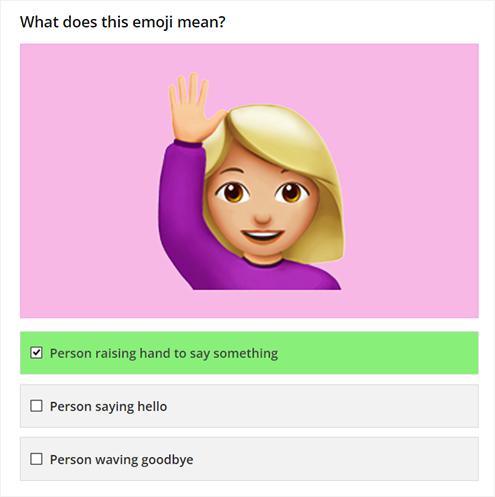
Namita Bhandare (Twitter: @namitabhandare) highlights a major issue - when you use emojis to replace the usage of words. you cannot be sure that users will interpret the emoji as you intended.
Namita asks "what does that teary emoji represent anyway? Are those tears of joy, laughter or frustration? Those two palms joined together? Prayer? High five? Plea?"
As someone born in Gen Z and a Social Media Manager, I would consider my emoji understanding to be near perfect. However, I scored 11 out of 15 in an online emoji quiz! Granted, the quiz featured some options that without context, you could argue the emoji fits into all the options provided.
Using hashtags
Hashtags help indicate the theme of your post and is a label for social. Using the hashtag symbol before a relevant keyword on social media sites will categorise that post and make it searchable.
However, it’s not uncommon to see a company plaster hashtags all over its post, which makes it not only ugly but also not accessible.
Tips for using hashtags:
- Hashtags should go at the end: like emojis, screen readers will read out any punctuation marks left behind by hashtags. To not disrupt the screen reader, it is better to include hashtags right at the end of the post
- Use pascal case for hashtags with multiple words: you should capitalise the first letter of each word to make the hashtag more legible for users and prevent any confusion when using a screen reader
Using pascal case
PSA…
— Jon Gibbins (@dotjay) July 9, 2020
blacklivesmatter is pronounced by screen reader software something like “black live (the verb) smatter”
BlackLivesMatter is announced as you might expect: “black lives matter”#SocialMedia #Accessibility


