Greenwich Music School brand identity
This project has been assigned the following categories: Brand development,
-
Brand identity
-
Window graphics
-
For children and parents
Client overview
Based in London, Greenwich Music School is a registered charity and centre of excellence in music education — providing high-quality music courses for everyone from early years to adulthood.
Project overview
The Greenwich Music School’s identity had grown organically over the years and it was recognised that it was a little confused and uncoordinated.
Scaramanga was tasked to conduct a review of their brand identity and deliver a brand recommendations report, a new logo, window graphics and website design.
New identity
Our brand review made several recommendations, but simplifying the logo was a key starting point. In fact, we all agreed that it was important for the organisation’s name to be spelt out and not rely on the GMS initialism because anyone outside the Greenwich Music School bubble wouldn’t know what it stood for.
There was also an over-reliance on the G icon to represent the organisations, so we ditched that in favour of the stronger word type logo. The following animation show the original logo and our transformation.
Greenwich Music School logo before and after redesign
We took a reductionist approach to the original chaotic brand, simplifying the logo and colour palette to red, white and black and consolidating the brand typefaces.
Before and after animation of the Greenwich Music School logo
Window graphics
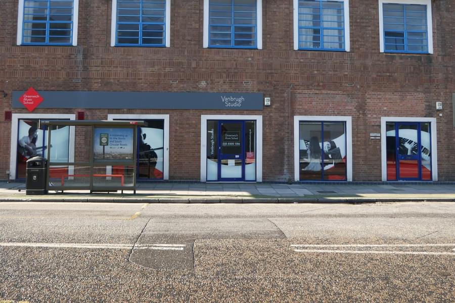
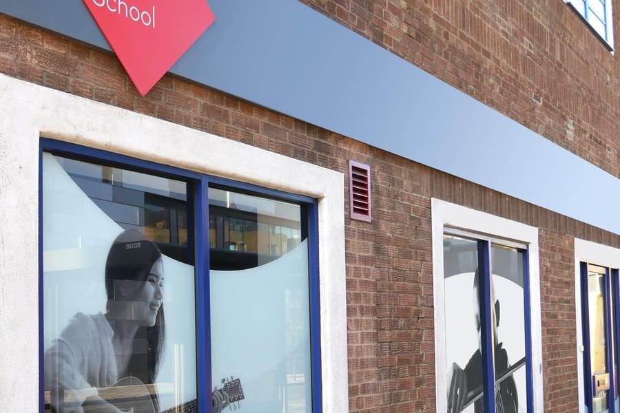
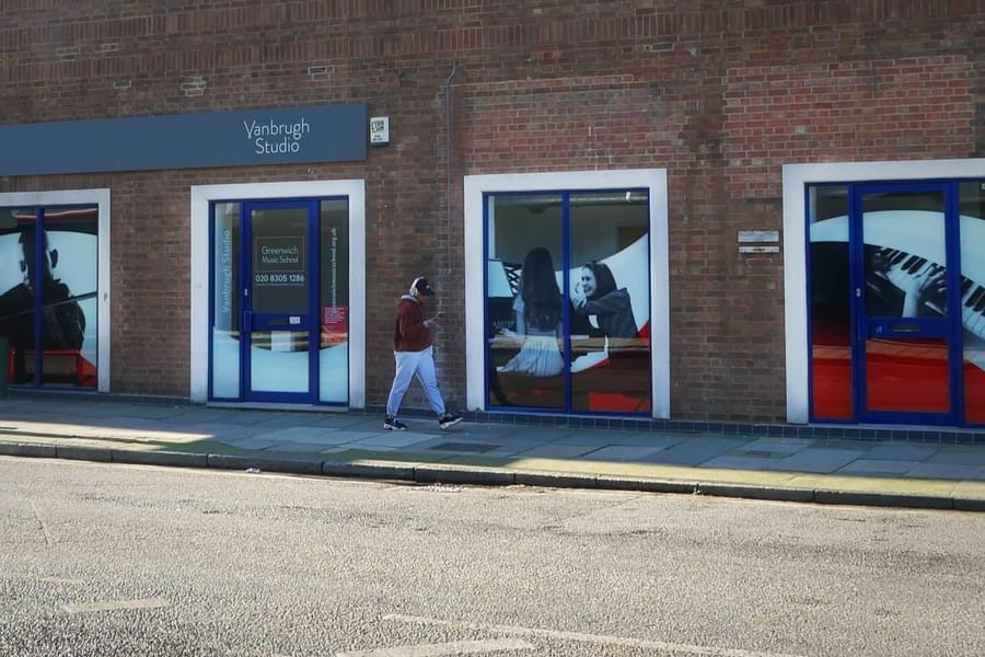
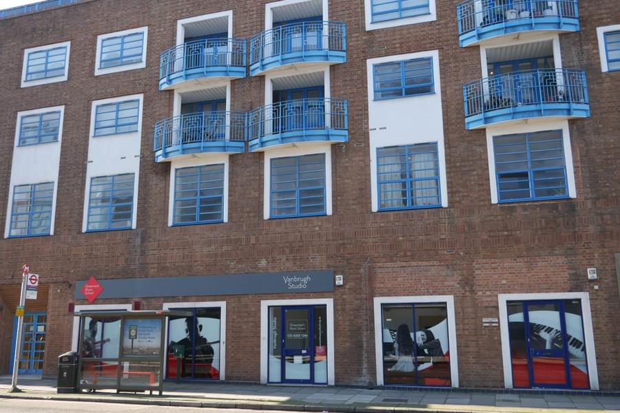
After plundering the client's excellent image archive, we created a series of multi-purpose graphics to represent the diversity of students and classes.
The animated version below was used on the website to bring it to life…
Website footer graphics
They were also used to dress the windows of the school to add eye-catching graphics to promote the school’s activity. The follow animation shows how the school’s exterior looked before and after the new graphics were applied.
Window graphics before and after redesign
The Greenwich Music School website
We have simplified user journeys inline with modern UX principles whilst also providing the user with a visually rich and engaging experience. Reducing the amount of content on the website’s homepage ensures a user can quickly and easily understand who they are, the services that they offer and if it is relevant to them.
Of course, the website is imbued with the new identity targeted at parents. The original clichéd approach is now replaced with a sophisticated design that communicates Greenwich Music School’s USPs whilst being a website that is far easier to navigate by the users and manage by the small in-house client team.
The Greenwich Music School website
Like what you see?
Book a meeting with our experts and let’s find out how we can help you.


