What the humble bathroom can teach us about accessibility
Written by Team member
In this article we will take a brief tour of a place we visit every day, but pay little attention to: the bathroom. We will uncover some UX faux pas which seem blindingly obvious, but go unnoticed.
This article has been assigned the following categories: Accessibility,
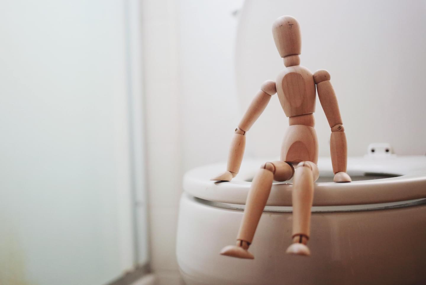
In this article we will take a brief tour of a place we visit every day, but pay little attention to: the bathroom. We will uncover some Accessibility and UX faux pas which seem blindingly obvious, but go unnoticed.
My curiosity about the accessibility minefield that is the humble bathroom started when I was on holiday in Spain.
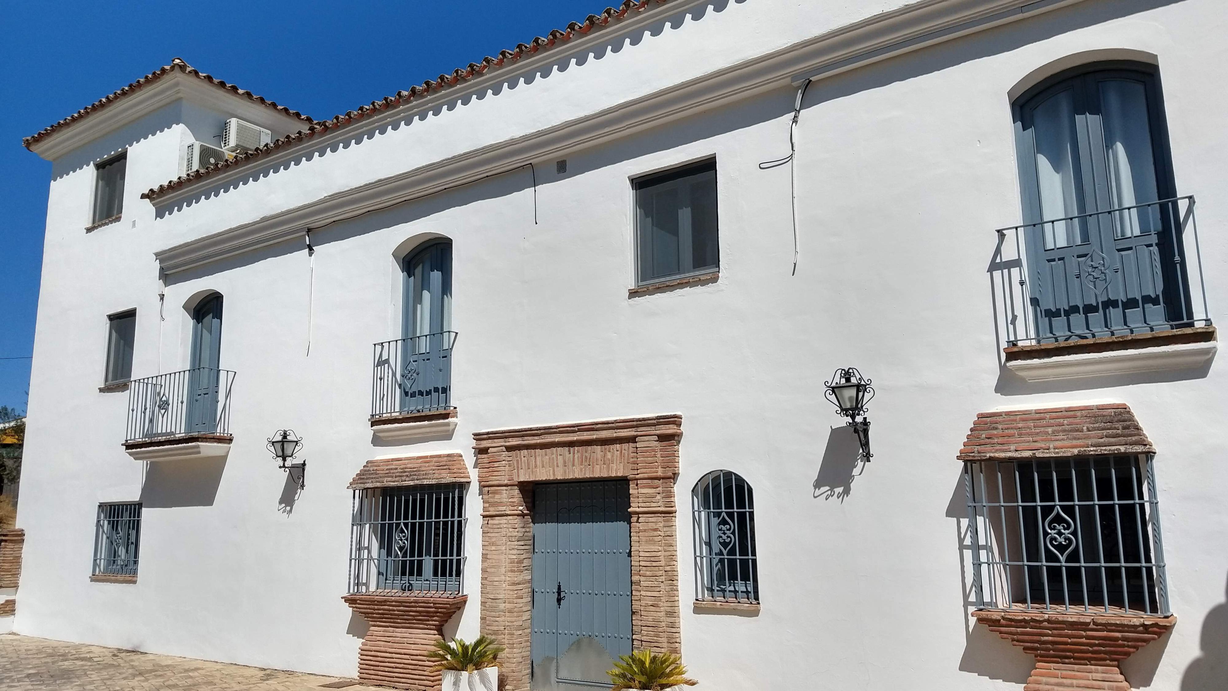
We were staying at a beautiful hotel at a remote location in the Spanish countryside. The rooms were simple, yet elegantly designed. The bathroom had an old fashioned faucet with ceramic insets on each handles. The letters C and H were inscribed to denote Hot and Cold, however, to my surprise, I discovered that the tap with C dispensed hot water. I soon realised my error. C stood for caliente and H was in fact an F for fría, the Spanish for cold.
My Spanish is non existent, but I am a fast learner — especially when I scald my hands. So I quickly adapted and learnt which tap to turn when washing my hands. However, this experience got me thinking – setting aside my inadequacies – that part of the issue was the information I was provided. It did not accommodate for users whose first language was not native to the current environment.
The more observant amongst you are probably thinking why I did not spot the F, as surely that was a bit of a giveaway. Well, to compound the issue, an old-fashioned script typeface had been used to denote hot and cold made the F look like an H which added to the confusion.
Clearly I know how to use a tap, but the environment was not tailored to my needs. This is the essence what User Experience (UX) design is all about: thinking about the needs of others – especially for the more simple minded amongst us, like me.
Design affordance
Creating an environment that works for us humans is difficult. We are complicated. We have different needs and it is someone’s job to think about how to design for those needs.
I realised very early on in my career as a designer, that every object on this planet has either been designed by Mother Nature or by (wo)Man. Evolutionary design takes time. Lots of time. Humans are relative newcomers, so we do our best. Sometimes we succeed in designing products that work without the need for refinement. Take the knife, spoon and fork. They have done a solid job for thousands of years, without too many modifications.

They don’t require too much explanation on their use as they have affordance, but there are other everyday items that need instruction booklets.
We can find many of these objects in the bathroom…
The exit door handle
Everybody washes their hands after a visit to the bathroom, right? I hate to break it to you, but not everybody has the same hygiene levels as you and I.
I am sure you have seen this sign before.
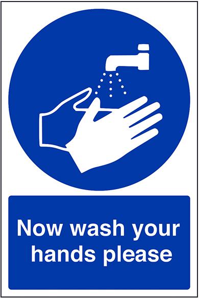
Like a good citizen you wash your hands. Then use the hand dryer (more hygienic than a towel) or paper towels (less harmful to the planet than a hand dryer).
You have beautifully clean hands so you are ready to exit and you are confronted with this…
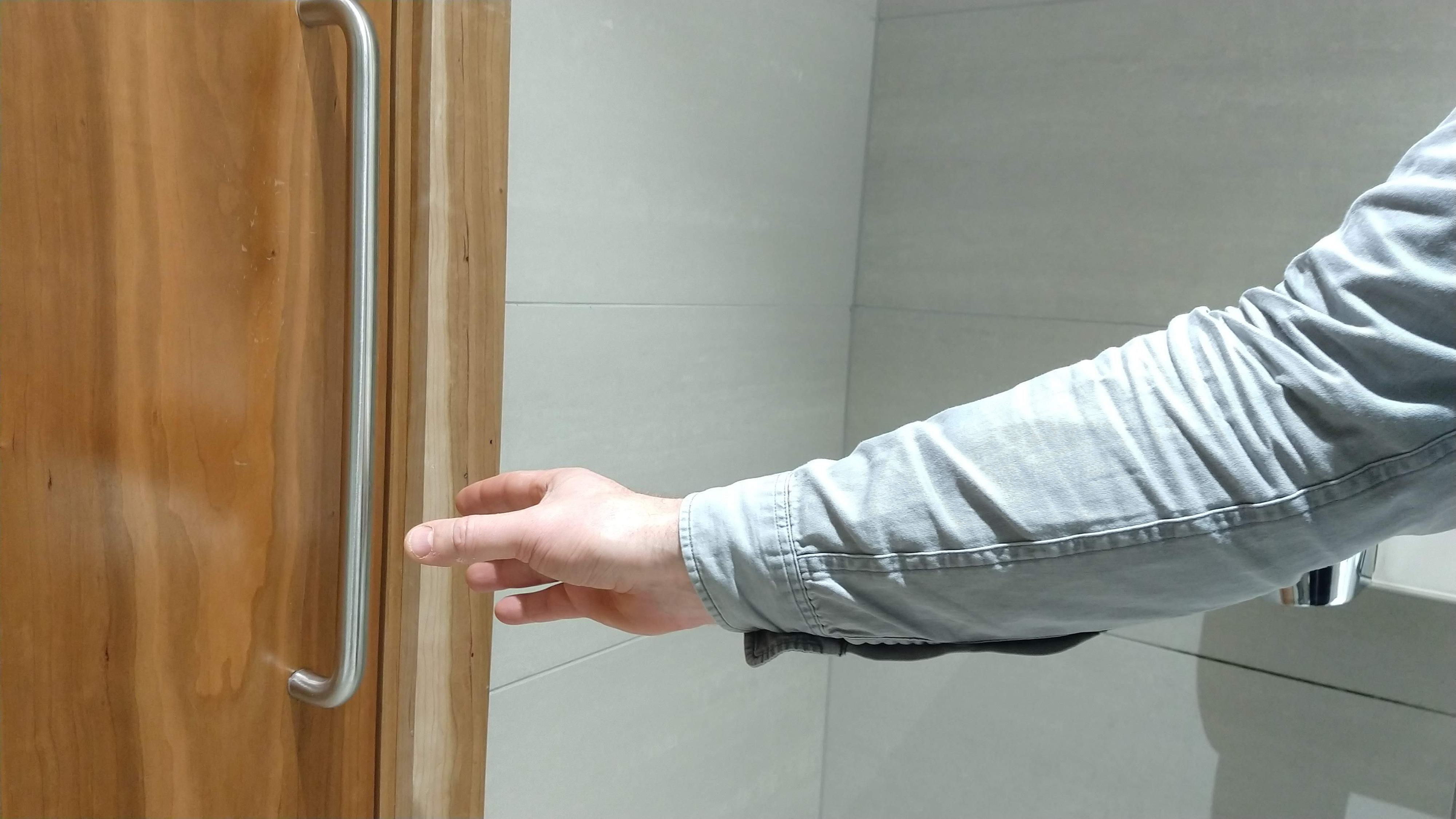
No way am I touching that! I have seen how many people don’t wash their hands.
I have a strategy. Wait until someone enters/leaves and catch the door with my foot or go back and grab a paper towel (if the bathroom has one). Then, depending on the handle, there is the pinky finger hook, the elbow grab, bum push. Finally, there is the reliable roll-the-sleeve down method.
Wouldn’t it be great if doors swung the other way so you could push it with your foot.
There are already solutions to this design problem, but it is not uncommon to be presented with a barrier like this in everyday life.
The occupied or unoccupied cubicle
Who would have thought the bathroom would be such a accessibility nightmare. Don’t worry, there are other problems to deal with in the bathroom.
It is very common to indicate states with colour – often green (go, okay) and red (warning, not okay). Our office’s toilet facilities adopt this flawed system to indicate occupancy. Flawed, because 1 in 12 men and 1 in 200 women have red/green colour blindness.
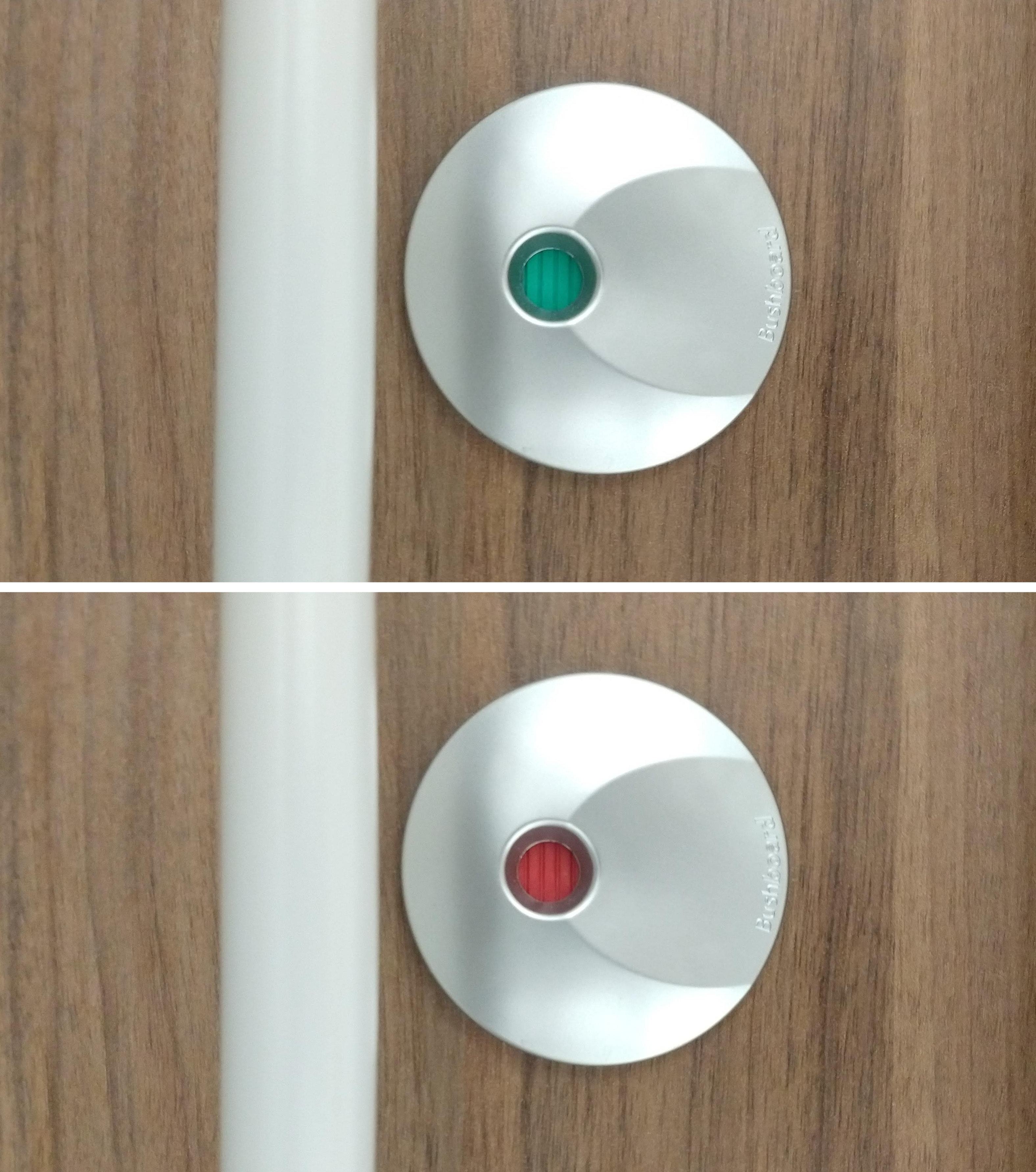
For these people, the only way to know if the toilet is occupied is to peer under the gap to see if there are feet or open the door and hope it has been locked!
There must be a better way to indicate occupancy.
A toilet offering an ingenious user experience
I was visiting a client and used their facilities. I was struck by their ingenious solution to change user behaviour.
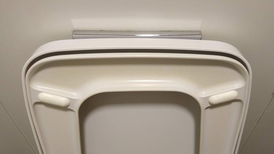
For all the women reading this, you will appreciate the simplicity of this solution. The flush was placed behind the toilet seat.
I can almost hear my mother’s words echoing in my head, ‘When you’ve finished, put the toilet seat down!’ A house full of boys could not have been fun.
It’s not flawless. This would be a big problem for a person with a visual impairment, but it may encourage people to close the toilet seat. Of course, it does not make them flush the toilet after finishing their business. Those people need additional help that this article can not provide.
Okay. Can anyone spot what is wrong in the previous images? This…
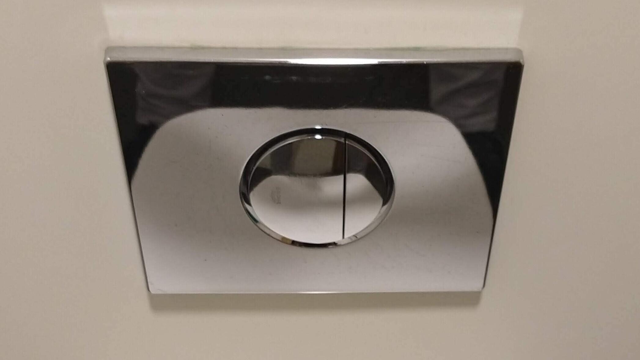
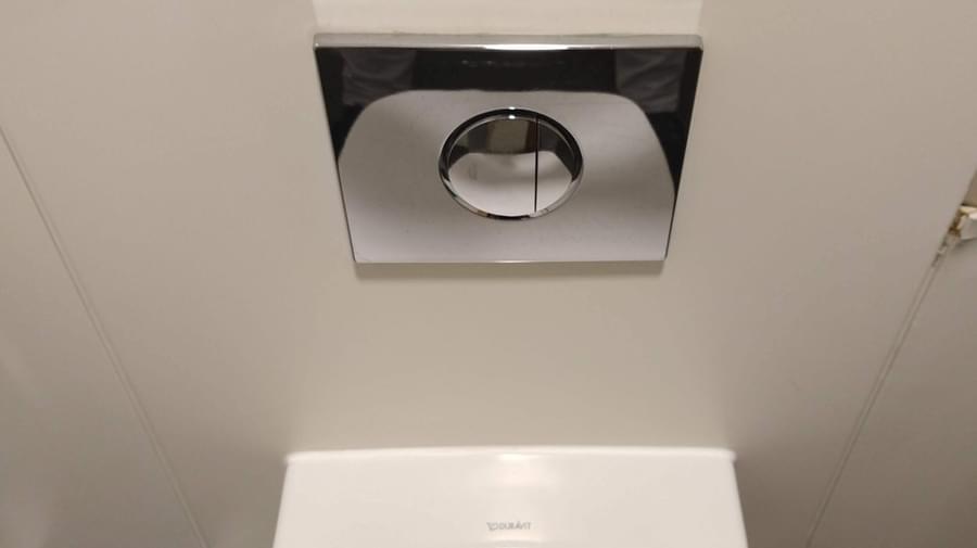
The dual flush button
This innocuous device has caused me much consternation. That’s consternation, not constipation.
Can you tell me which is the long flush and short flush button?
Does the big button mean more water or is it bigger for convenience as it is the button we are likely to press more often and therefore this button is for the short flush?
The problem is there is no way of knowing from the information provided. You just have to push a button and hope.
The irony is that this lack of affordance results in potentially no saving in water usage, which is the whole purpose of the dual flush system. You have 50:50 chance of getting it right and, if you get it wrong, then you may have to double flush negating the original purpose of the dual flush system.
To compound the issue there is no standardise design pattern, apart from there being a big and a small hit area.

In the small selection shown above, there is (in my opinion) another problem with the inset button. This, my friends, requires the precision of a heart surgeon and fingers the size of a 3 year old.

Think about the parallel in the world of User Interface (UI) design. Have you ever tried to click a link on a touch device that has simply confounded you and you’ve given up? Or visited a website with an adventurous design approach for navigation that doesn’t follow a conventional design pattern, so you spend more time learning how to navigate rather than getting to where you want?
Fortunately, we humans are a clever species. We use heuristics (as do other species) to process the visual feedback our brain is receiving to find solutions to complex problems. Our brain will run a set of mental processes to assess the problem. It relies on previous experiences to make an educated guess or we may simply use intuition. If previous experience does not exist, then trial and error is the next choice which we then learn from and store for the next occasion we’ll encounter this same problem. Scalding hands anyone?
Common sense would suggest to me that the big button is for more frequent use and, therefore, a shorter flush.
Ask a room of people this same question and I have discovered there is generally a 50:50 split.
In case you are wondering, the large button is actually the long flush, releasing 6-9 litres of water and the small button 3-4.5 litres. Although I don’t know what happens if you push both buttons at the same time. Anyone?
There is a caveat to this. In my home, I discovered the plumber had crossed over the tubing that lead from the two buttons, so the big button is a short flush and small button a long flush. This has resulted in my persistent utter confusion and mild panic whenever I visit the bathroom. In fact, reading through DIY forum posts, it reveals that manufacturers seem to take a different approach to which button does what anyway.
Resolving the dual flush button conundrum
We have discovered that our ability to interact with the device is massively hindered by:
- Lack of affordance (clues about how an object should be used, typically provided by the object itself or its context)
- An unergonomic design (an already small button with an even smaller inset button) leads to inconsistent results.
- No standards leads to confusion.
- No labelling means the action of the user begins with guesswork, leading to frustration and, in this case, water wastage.
What can be done to overcome this issue? Well you could add a sign providing instructions.
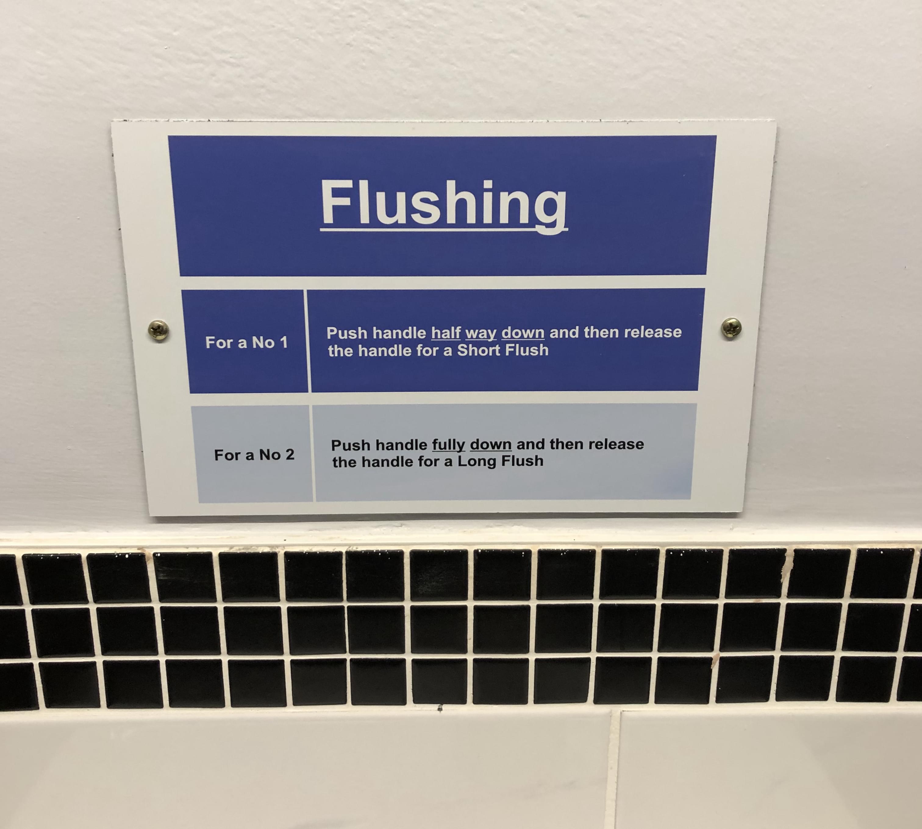
I think we can agree that this is not the solution.
We could add words to the buttons, but this has its problems.

What language will the words be written in? Think back to my problem in Spain.

If the words are to be translated for different territories, will they fit on the button? However, can we guarantee that every user will speak this local language.
Numbers won’t work either.

If we rule out words and numbers, then we probably should use the global language of icons.
What icon should we use?

Perhaps not. Let us try a water droplet as this is less offensive

This does not provide much information. Let us try indicate the volume of water.

Not bad at all, but we have not thought about users with impaired vision. If we alter the design to include braille and icon then we can provide tactile feedback to the user.

Hallelujah, I think we may have got a step closer to solving the problem of the dual flush system. Sure, this isn’t perfect. We could explore different variations for the icons, but it demonstrates our point.
The end
Humans have the capacity to endure and adapt, so we can find ways to overcome any shortcoming of a design system. However, that doesn’t mean the flaws of a design should persist because people are willing to put up with it.
When designing (or assessing if you are the client) anything humans will interact with, you need to think beyond yourself. Think about the different ways users will interact with your product and, hopefully, you will design something better. If it works then your design efforts will go unnoticed, because the user interaction will be effortless. I like to call this invisible design — a phrase borrowed from Deiter Rams who said ‘Good design is invisible’.
Designers tend to want to leave their mark, but they should revel in the beauty of producing something that invisible.
I hope this article will have opened your eyes a little or, at least, made you look at bathrooms in a whole new way. And next time you are designing a User Interface, consider how your decisions will impact on the people who will be interacting with your design solution.
