Overcoming the mystery of building accessible websites
Written by Team member
We like to think of ourselves as accessibility experts, but developing that expertise has taken time. Along the way we have come up against many myths and misconceptions. Here is what we have learned about them, and what we do to ensure that your next website will be usable by all.
This article has been assigned the following categories: Accessibility,

Accessibility is at the very centre of everything we do here at Scaramanga. The cornerstones of accessibility and inclusivity serve as a guiding force for decision making at all stages of every project that we undertake. Reaching this point has taken years.
In this article, we will reflect on some of the lessons we have learned, share the knowledge we have gained, and provide an insight into how our entire strategic and creative process now considers the needs of all from day one.
We hope it will leave you inspired to join us in making the web more accessible, one website at a time.
Why is it important?
In an industry full of innovation and creativity, investing time into accessibility might not seem an attractive or worthwhile proposition. This is not the case. Luckily, recent years have seen accessibility come to the fore in our industry. This is great!
Companies big and small started to take note, and make strides. Some of the developers of our favourite tools have even released big updates focused solely on enhancing their accessibility.
That being said, statistics show that, despite its increased prominence, approximately 70% of websites suffer from “accessibility blocks” (Source: WIRED). This, in our eyes, is not good enough.
There are many reasons why we do not think this is good enough, but to give you an idea, it's worth highlighting a few key points that we have learned from the common misconceptions mentioned earlier:
Some may think that accessibility is only useful to a minority, but in fact anyone can benefit from accessibility features. To those who need it, it is essential, but to those who don't need it, benefits include easier navigation and a lack of unnecessary complexity
Following on from that, it's worth noting that an "able" user can become a disabled user temporarily. We have even seen this within our own team
Many website owners have a legal obligation to ensure their website is not inaccessible
Finally, if by this point you need more persuasion: more users can mean more customers. And even if it doesn't, doing the right thing shouldn't require a profitable reason
Is it more expensive?
This is the main myth that needs dispelling, the perception that implementing accessibility is expensive and time consuming.
This is not the case, and when you work with us you get all of these benefits at no extra cost because we believe in our ethos that accessibility is not optional.
Our process
At this point you may be asking: how do we prevent our websites being a part of that 70% mentioned earlier? Well ...
Our process incorporates accessibility from day one. And that mitigates the risks from one of the most invasive myths around website accessibility that we have come across: that a website can be made accessible by adding accessibility features at the end of development, just before launch.
This school of thought is not without merit. In order to know the ways in which your website is inaccessible, you may need to test it. Be that through user testing, automated tools, or otherwise. But testing a website that does not yet exist is obviously tricky.
Our argument is that if you broach the topic of accessibility at the start of a project, consider it at every step along the way, and ensure that those involved in the process are experts in their craft, you can build accessibility features in to the website as you go, preventing accessibility errors in the first place - rather than wait until the end of a project to fix them.
So what do we do at each stage of a project to achieve that?
During strategy, if not before, we take time to educate our clients about accessibility during meetings. Then we build upon that knowledge as we conduct exercises that consider how to structure a website such that key content and functionality is brought to the fore. This increases the probability of the end product being as user friendly as possible.
Later, our designers will build upon that work to create responsive designs with clear and easy-to-use navigation. They will also factor in accessibility when making stylistic decisions about colours, fonts and patterns.
At this point, the WCAG guidelines come into play, as we test our designs for sufficient colour contrast ratios and suitable font sizes. Where applicable, the use of patterns or shapes to indicate status will be considered in order to avoid relying solely on colour to do so.
By the time a project reaches development, the tricky decisions have been made. And it is up to our developers to rely on their years of experience to write code that contains accessibility features as they go. This ensures nothing is missed – a possibility when adding these features in one big go at the end.
And once we've built the website, we test our websites using the same tools that real world users rely on.
Content
Like with many creative disciplines, having all the gear does not ensure you know what to do with it. Giving Joe Bloggs a professional camera does not guarantee that their next photo will end up in a gallery. Likewise, giving our clients a feature rich website with a brilliant content authoring experience does not guarantee the production of excellent and accessible content (not to say that we think you couldn't).
Rather than leaving our clients to it after we hand over a fully built website, we take the time to show them how to get the most out of it. We do CMS walkthroughs, and build on the conversations around accessibility we have been having since the project began.
We educate our clients on the process of how to create accessible content for their website. Some examples include:
Writing copy that is clear, concise and avoids ambiguity
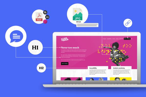
Adding descriptive alt text to images on the website
How to use rich text editors to correctly structure documents
Using our content matrix to add media to their website in the proper way
Just to name a few. There are more.
Ongoing support
By this point, together with the client, we have laid a really solid foundation for an accessible website going forward. With any luck it will be functional, beautiful and performant!
However, accessibility is an ongoing practice, so we make certain that it is considered continually through any ongoing maintenance or when adding new features.
Internally, we are also constantly sharing new knowledge we obtain about accessibility with one another, and ensuring that new team members are brought right up to speed when they join the company.
Conclusion
By now we hope the benefits of having an accessible website are abundantly clear. And hopefully you have enjoyed getting an insight into what we are doing at Scaramanga to provide our clients with those benefits.
If you are ready to take the next step into making your website accessible, we would love to help. If that means building you a brand new website packed to the brim with accessibility features - awesome! But if you would prefer, we can audit an existing website to show you how it could be made better. Either way, we would love to have a discussion with you, so get in touch.


