Cognitive psychology in UX design
Written by Team member
A look into the cognitive psychology of visual perception in UX design using the Gestalt Principles.
This article has been assigned the following categories: Accessibility, Inclusivity and diversity, Design,

I’m no psychologist.
Eighteen or so years ago, when I first professionally entered the design industry as a fledgling junior graphic designer, I never expected myself to do more than create some cool websites, printed adverts and what I perceive to be a designer's pet peeve, Christmas cards. No, I can’t add more snowflakes! The thought of designing Christmas graphics makes me go weak at the knees and not in a good way, especially after my “incident”.
I digress; I’m no psychologist. Psychology however, has an important role in designing websites. There are a set of principles that every designer, junior or otherwise, should be applying to their creations to nurture better user engagement and give their designs a more coherent and visually appealing presentation. The name of these principles: Gestalt principles.
What is the Gestalt principle?
Gestalt psychology was pioneered by three psychologists in the early 20th century. Max Wertheimer, Kurt Koffka and Wolfgang Kohler and their aim was to understand how humans made meaningful perceptions of chaotic stimulation.
The word Gestalt finds its origins as a German term with no direct translation to English, but generally meaning ‘whole’ or ‘form’
The Cambridge dictionary definition of Gestalt.
“Something such as a structure or experience that, when considered as a whole, has qualities that are more than the total of all its parts.”
(source Cambridge dictionary)
The principles of Gestalt
I’ll be covering the following principles in this article, but please note that the Gestalt Principles contains more:
- Similarity
- Proximity
- Common region
- Focal point
- Closure
Similarity
The similarity principle means elements that look alike or have similar qualities, for example the same colour, shape or size are generally grouped together because they share common functionality and to maintain consistency throughout a design.
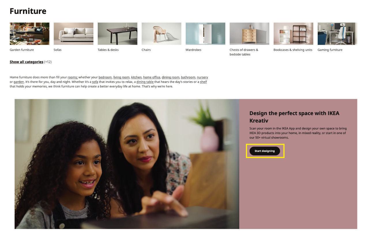
Take the IKEA website as an example, notably their product listing page. Throughout the page there are a number of buttons, text links and jumps linking off to the various products.
All of the buttons have rounded corners, which is consistent design treatment applied throughout the site. This allows me to instinctively identify them as a button and I know that hovering my mouse (or tapping them on my mobile device) will perform an action that will take me to a new page.
Similarly, they have also used circular buttons containing an icon without a label, yet as they share the same colours of the buttons they can be easily identified as interactive elements. This visual association informs the user that these icon based buttons have a similar role and function as the text based buttons.
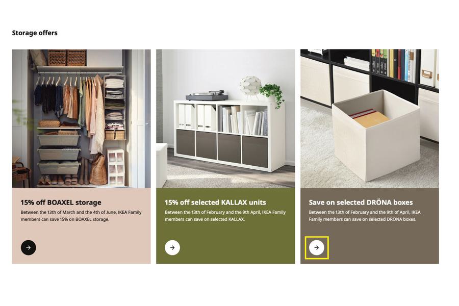
The IKEA site also uses a variety of background colours on their Call-To-Action panels. Again, the same colour theory is applied to these panels so the user can feel confident that these are interactive as the visual identity of these jumps is consistent with other interactive elements that they have encountered elsewhere on the website.
Proximity
With proximity, the principle behind this is that elements that appear close together are related to each other as opposed to if they were spaced far apart.
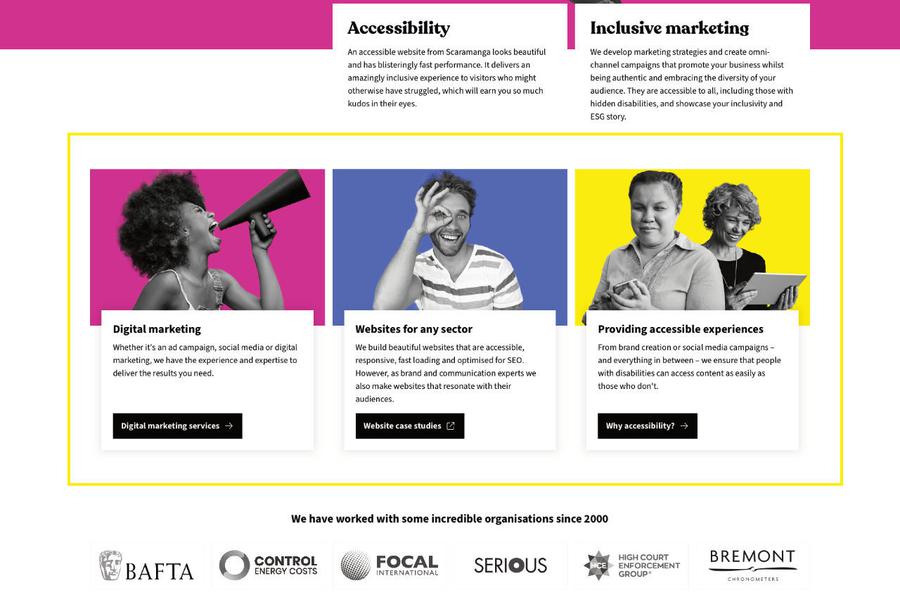
Using the Scaramanga website as an example, the three featured jumps; ‘Digital marketing’, ‘Websites for any sector’ and ‘Providing accessible services’ on the homepage are in close proximity. They all share the same qualities, correct? All of them have a bold title, some copy and a button. The button shares the same space as the copy in close proximity, informing the user that these buttons are related to the content. Had this button and text not been in close proximity, a user may not understand that the two are connected, giving them pause and not understanding the connection between the elements.
A delay in connecting the elements could have a detrimental impact — in that the user may close down your site and go elsewhere for the information. It could be incredibly harmful to your business if this issue persisted, especially if a user is browsing on a shopping site and the ‘Buy’ button isn’t located near the product. Something so simple could cause a massive negative financial impact to a business and it’s something that needs to be strongly considered in the wireframe stage of your design.
Common region
Sharing an overlap with proximity, the common region principle purpose is to group lots of elements together in the same closed region. An example of this is the headers on a website. The locations where you would commonly find the logo, exposed navigation, maybe a search bar and probably a burger menu containing links to other pages within the website. But how is this different to proximity? Simple. By adding a border on the bottom of your header or having the header in a different colour, you’re closing off these elements into a common region where they’re all related, but still visually staying consistent to the design of the site.
Phew! You with me? Have a look at the Linkedin example below.

Focal point
The purpose of the focal point principle is to visually capture a user's eye so that they focus on a particular point.
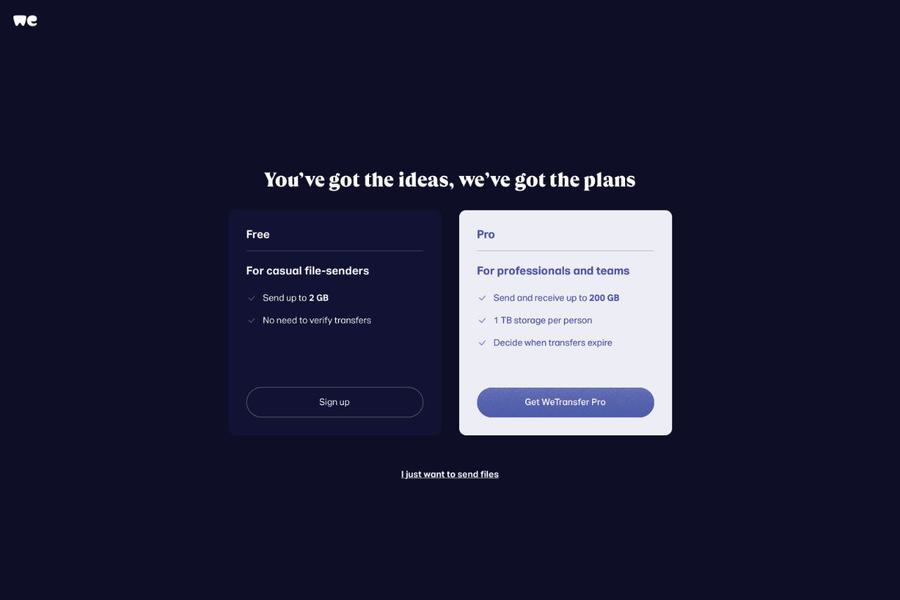
A good example can be seen above on WeTransfer. There are two boxes sitting on a dark background that detail the different plans on offer. The free plan, to the left, has a darker background with little contrast between it and the background of the site. It’s still accessible, readable and clear but it has been assigned lower in the page’s hierarchy. The button is recessive (meaning it doesn’t have a solid background) until the user interacts with it when, even then, it has a barely perceptible change to its colour to indicate that it is an interactive element.
To the right, the premium plan is presented in much lighter colours creating a stronger contrast to the dark background. The panel uses a brighter colour and has a large button encouraging the user to ‘Get WeTransfer Pro’. When I landed on the page that was the first thing that I noticed. This visual trickery has meant I was forced to read the benefits of the paid plan before I did anything else.
Do a little test; close your eyes or look away and focus on something else for a second. Now look back and nine out of ten times I bet you first laid your eyes on the right box, then the left box. I bet you didn’t notice the text link underneath ‘I just want to send files’ until you were really looking at the page? Unless this is a return visit or you’re a frequent user of this site and know what you want to do, you probably won’t notice it immediately.
Interestingly, in print, the optimal position for an advert is the bottom-right and is referred to as the ‘anchor’ position. This is because it is the first area the eye looks at as you turn the page.
The focal point is a tactic deployed a lot across websites and print. Look at pricing plans for example on any web hosting site and I bet you will find one that the company wants you to select will be given greater visual prominence by changing its colour, increased in size or containing some sort of graphical element to it to attract attention.
Closure principle
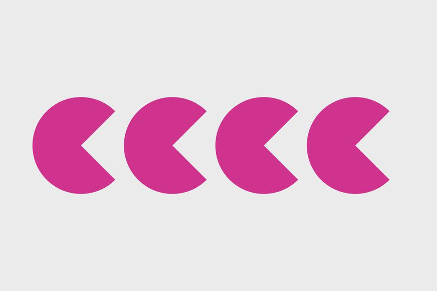
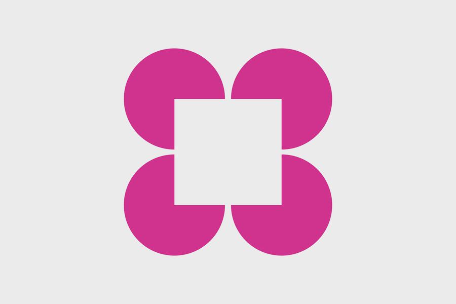
The closure principle is often applied to logos. The meaning behind it being that if we had a lot of complex shapes arranged in a certain way they would inform the brain to look at them as a complete element. Separated, the shapes mean nothing. Together, they make a word, letter or illustration and humans fill in the blanks because we recognise the shape. Below are a few examples of the closure principle in action. These images and logos have a strong recognition factor simply from their form.

Conclusion
As designers, we don’t need to be psychologists, but we need to have a basic level understanding of the human psyche. What attracts the eye for it to focus on, how does the human brain form the shape of a letter if elements of it are missing, or how does a user know that your ‘Buy more’ button is associated with the content?
Once we understand the why behind it, we can create the how, ultimately designing a better user experience for your users.
You may also be interested in reading another article around the 'Psychology of Selling' by our very own Technical and Creative director, Simon.
If you think your new website or project would benefit from a more caring, inclusive and accessible approach to design then get in touch and share some details about your project.
